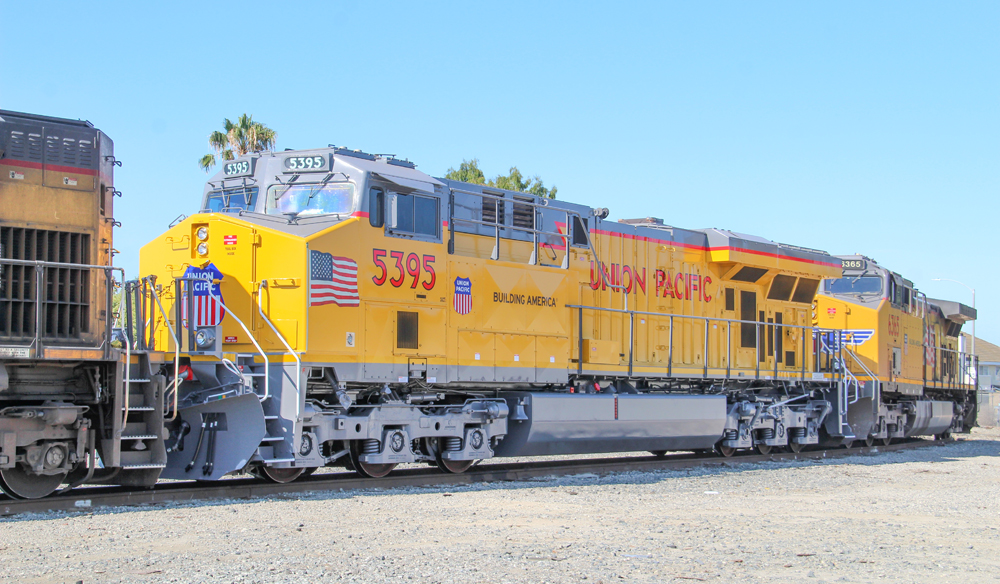
ANAHEIM, Calif. — A new Union Pacific locomotive paint scheme has surfaced, although it is unclear whether the design represents a change, a test, or a one-off for some other purpose.
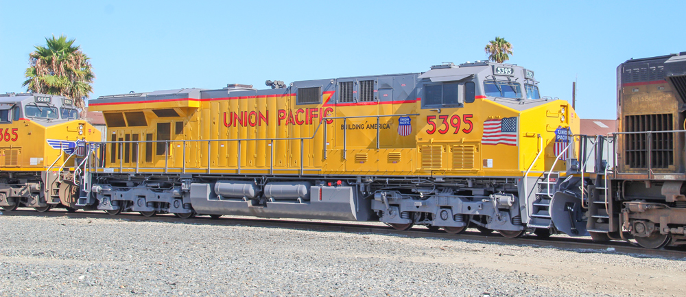
Photographer Bruce Jacobs photographed the ES44AC — a C45ACCTE in UP terminology —in Anaheim on July 18. Differences from the current standard UP scheme include a small American flag on the short hood instead of a large flag over the engine, the return of the more traditional “Union Pacific” lettering on the long hood, and a larger UP shield, without wings, on the nose.
Trains News Wire has asked Union Pacific for comment, and will will provide an update with any response from the railroad when it becomes available.





Think of why the original UP (as well as the connecting Central Pacific) was built: to connect the East and West parts of this nation together.
And this “redesign” took six months? (!)
I don’t think that the flag should be part of any corporate identity. They are not being operated for the benefit of nor representing the country.
Also get rid of the lightning stripe and the flag. Then you’ll have the correct scheme! Just reuse the same design from UP’s C40-8’s. That was perfect!
Don’t retain the U.S. flag in any fashion (dirty and peeling decals of our national flag are distracting), but keep the shield and wings on the nose. They recall the heady days of the UP Streamliners and their E-units.
keep
Not to be a party-pooper, paint the locomotives gray. The UP locomotives are filthy, and the yellow makes that stand out. (Look at the 70ACe in front of the GE.)
The SP had it right: Lark Gray.
Or, wash the darn locomotives more frequently.
I like the wings, I’d miss the wings, but the wings are not part of the UP logo except in the context of the front of a locomotive. Even historically the wings were on generally passenger equipment (except some of the Turbines).
I wasn’t a big fan of when UP added the flag to the locomotive, and even less impressed when the decals wore off. This version is oversized and not very relevant.
I would move the large “Union Pacific” title on the long hood about 1/2 letter-height lower to get away from the jogging red stripe. Other than that, I think it looks OK.
Long hood and smaller flags look fine.
I will miss the wings on the front. The nose looks plain and uninteresting without them.
The new UP scheme is among the worst change since Great Northern changed its paint scheme to black, white and blue in the late 1960s and Canadian Pacific adopted bold red stripes and abstract ”CP” logo in the early 1970s.
Union Pacific would do well to retain the classic shield with wings on the front of locomotives. The large American flag on the franks of the hoods gives added dimension to Union Pacific’s armour yellow paint scheme.
It’s terrible. Looks like someone didn’t care enough to measure things.
To me better than the large flag on the hood. I never was a big fan of that scheme as gets dirty and looks bad. Also was not a huge fan of wings on the nose. I like the large lettering on the sides, much cleaner and more traditional look.
The various adornments (flags, shield, logo, UP name) appear to be positioned randomly on the locomotive, rather than being somewhat aligned or organized. I have to say this livery does not work for me.
Interesting radiator arrangement very visible with this scheme