News & Reviews News Wire UP makes minor change to new paint scheme

UP makes minor change to new paint scheme

By Trains Staff | September 19, 2022

| Last updated on February 19, 2024

Flag decal will resemble larger design used for 20 years; nose herald will be smaller

Email Newsletter

Get the newest photos, videos, stories, and more from Trains.com brands. Sign-up for email today!

Three-quarter view of yellow locomotive showing American flag decal near nose
The latest version of Union Pacific’s paint scheme features a different American flag decal. (Union Pacific)

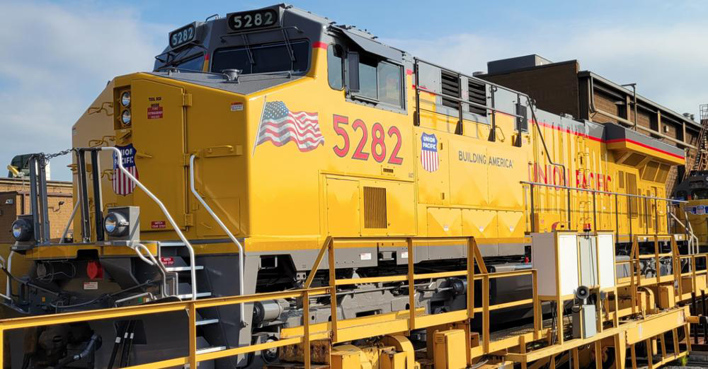
NORTH LITTLE ROCK, Ark. — Union Pacific has adjusted the revision of its locomotive paint scheme, changing the American flag decal at the front of the locomotive to a design based on the one introduced on the long hood of the locomotive 20 years ago.

UP announced the revision earlier this year, returning “Union Pacific” lettering to the long hood and moving the flag decal to a space near the front of the locomotive [see “Union Pacific redesigns locomotive paint scheme,” Trains News Wire, July 2022]. The design of that flag decal is different than the one featured in a post on the company website and in Facebook and Twitter posts Friday.

Yellow and gray locomotive with red trim
The earlier version of the new paint scheme also featured a larger UP shield on the nose. (Bruce Jacobs)

The railroad has said that employees voiced concerns about the wear the large flag decal sustained because of engine heat.

“We want to ensure that although the placement has changed in order to best represent the flag, we continue to honor our roots as we build America,” CEO Lance Fritz said in the Friday web post.

The revised paint scheme also features a smaller version of the UP shield on the nose.

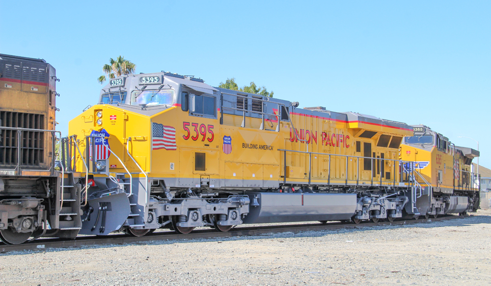
Locomotives will receive the new design as they pass through the Jenks Locomotive Shop in North Little Rock for modernizations or overhauls.

6 thoughts on “UP makes minor change to new paint scheme

  1. Really, the employees were concerned about how the flag looked with the heat generated by the diesel engine…something that could’ve been easier handled by a little cleaning more often…and I’m sure the majority of the public didn’t even notice or care.

  2. You missed something that I suggested at seeing the first version. I said the “Union Pacific” lettering on the side should be lowered to the same level as the number. I thought it looked like someone measured incorrectly with all of the lettering at different levels. I guess they were listening since everything now looks on the same level.

You must login to submit a comment