


Locomotive paint schemes
Nobody plans to create a less-than-stellar locomotive paint scheme, but at times, anyone’s best efforts can produce something other than classic. It’s also a matter of taste. I happen to like the red, black, and white design of the McGinnis-era New Haven, but a friend of mine thinks it’s just garish. The following are some of my thoughts on paint schemes that just did not make the winners list.
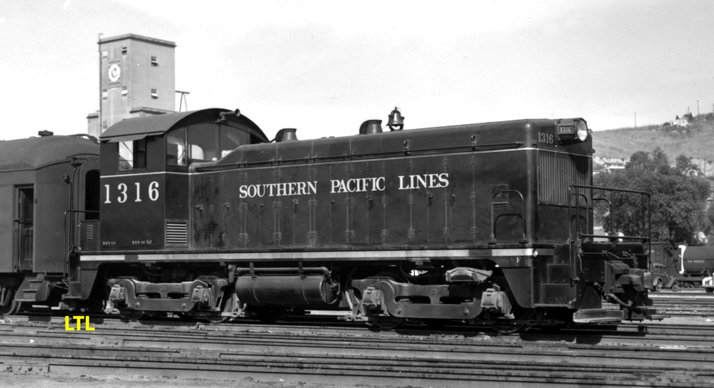
No. 1: Southern Pacific’s original switcher paint scheme
Railroad management usually had few problems painting its new passenger diesels in gaudy, flashy, eye-catching colors. Just look at Southern Pacific’s red, orange, and black Daylight scheme; Santa Fe’s classy red-and-silver warbonnet design, or New York Central’s muted but still stylish multi-stripe design.
But not yard switchers and freight units.
This prewar 1,000-hp switcher is decked out in EMD’s semi-official paint scheme. You can find similar examples on units delivered to Santa Fe, Union Pacific, and other railroads. Just change the lettering.
It can be argued that this is not a tacky design, but an austere one that management felt was all that was necessary for a locomotive that would rarely if ever be seen by the public.
This basic paint scheme rarely had longevity. SP, for example, started adding orange safety stripes, which later changed to orange trim. Santa Fe’s were redone with white stripes, making their units look like zebras, and Union Pacific started redoing their switchers in the same yellow as their passenger units. Other railroads did the same.
No. 2: Amtrak’s “Day 1” paint scheme
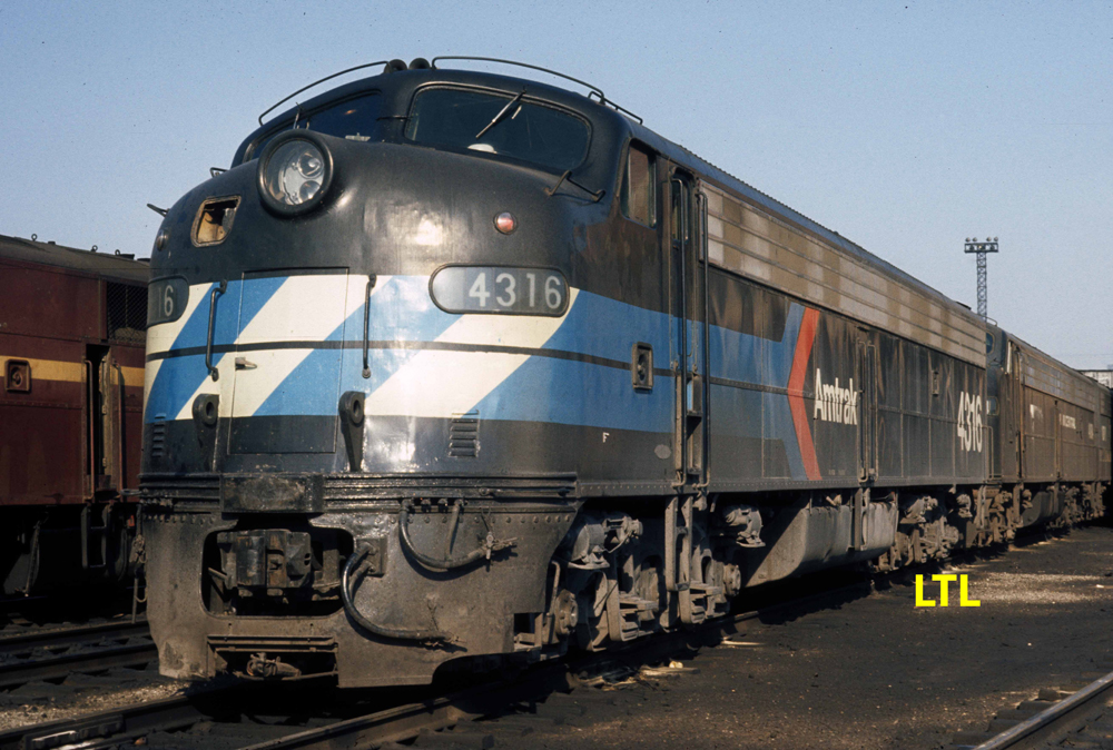
May 1, 1971, was Amtrak’s first official day and for any of you around back then, it was a time of multiple mish-mashed locomotives and car equipment that produced a riot of colors.
But even before the rollout, Amtrak marketing people knew they had to have at least one locomotive and one car decked out in a coordinated color scheme for display in New York.
The locomotive, an EMD E8A No. 4316 — originally a Pennsylvania unit — rolled out of the paint shop in black paint with blue stripes and a logo. It also had Amtrak’s pointless arrow. It was makeshift, it was temporary, but boy it was ugly. Coach 1589 was also part of the display.
No.3: Spokane, Portland & Seattle’s one off paint scheme
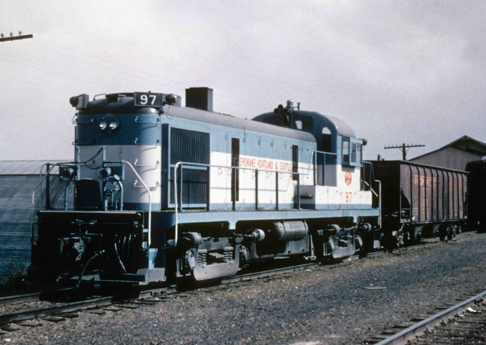
The SP&S Railway was known for its pleasant green and yellow paint scheme reflecting its owners – Northern Pacific, and Great Northern – and the Pacific Northwest area where it operated.
A fan favorite due to its diesel roster of predominately Alco products – punctuated by a smattering of EMDs and Baldwins — it was somewhat of a shock when the line dabbled in changing its image in the mid-1960s.
Yes, it is kind of attractive, but have you ever been to the Pacific Northwest? It’s beautiful, but there are also many overcast, drab days that such a paint combination would blend right in, especially in the winter. Speaking of winter, could you imagine what that paint scheme would look like after many trips over the system? It was eventually repainted into the railroad’s standard paint scheme.
No. 4: Kansas City Southern — a school kids version of a bicentennial paint scheme
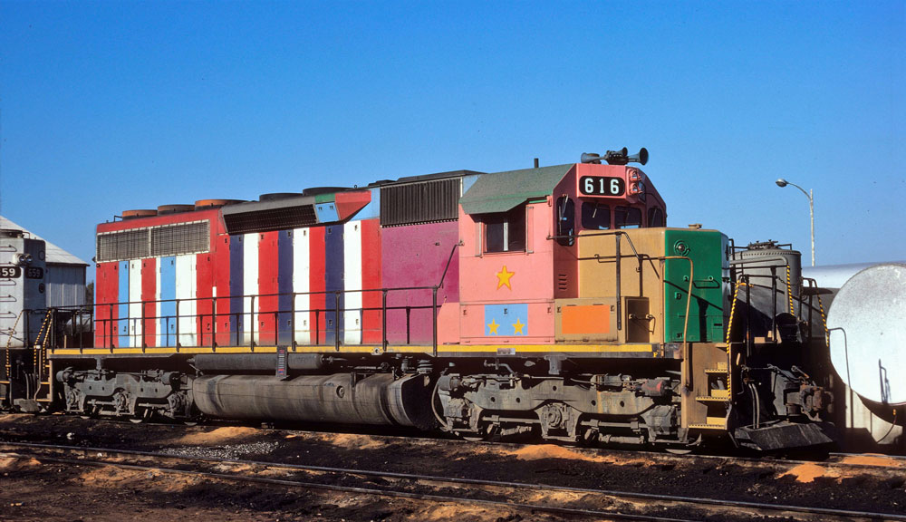
Argh! A great idea sometimes results in an unusual situation. Bicentennial fever was in full swing with many railroads both big and small throughout the country.
In a wonderful gesture of inclusion, Kansas City Southern decided to conduct a contest among local school children; THEY could design the railroad’s paint scheme, then the railroad would choose which to use!
The winner was an elementary school girl who did her darndest to create a multi-colored design using red, white, blue, maroon, salmon, mustard, and green! Looks like she possessed a 64-color Crayon set. Egads!
But for KCS, a promise was a promise, and EMD SD40-2s Nos. 616 and 642 were put though the railroad’s Deramus Yard shops in Shreveport, La. The units were eventually repainted into the road’s then-current white scheme.
No. 5: Santa Fe’s original road freight paint scheme
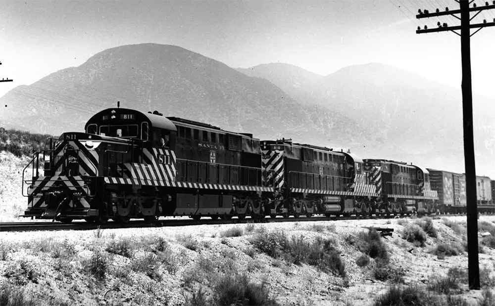
Santa Fe eschewed their classy blue and yellow freight scheme normally found on cab units for this zebra-like riot adorning its many road-switchers. This photo of three newly delivered Alco RSD15s being broken-in on Cajon Pass, Calif., in the mid-1950s is a prime example. Photographer Don Sims must have gone crazy trying to figure out the film exposure.
From a safety standpoint, the stark contrast between the colors made them hard to miss, which is what management wanted. But in reality, they looked to many like an eye chart gone berserk. Even the latter addition of Santa Fe’s billboard lettering on their flanks, while an improvement, was not exactly the look they were hoping for.
Finally, the road scrapped the black and white scheme all together and began painting the units in the standard blue and yellow adorning the freight cab units.
Many other railroads had less-than-stellar paint schemes … what are some of your candidates?

For me, the ugliest has to be the N&W’s 1970s era black and white. To add insult to injury, they reportedly paid an outside consultant to design this uninspiring paint scheme.
Rounding out my top 5:
Amtrak’s Phase 5. It’s almost all a silver grey colour that reminds me of a non descript rental car, with only minimal patches of blue. It looked particularly bad on the AEM7s, making them look filthy and in far worse shape than they actually were.
Connecticut’s current red and black. The logo looks like something a graffiti tagger would paint on a building.
CSX stealth. Take the original CSX blue and grey and, in a fit of cost cutting eliminate all the blue except the lettering. The end result looked like a fog bank rolling in. A dress rehearsal for Amtrak Ph5.
ICG dark grey and orange. A paint scheme that looked old and faded fresh out of the shop. One wonders if they got a special volume discount on those colours.
In all cases, these cheap paint schemes replaced something far better looking.
Unlike the article above, I have stuck with only those paint schemes adopted as official by a particular railroad. There are many other one offs out there that make you wonder what they were thinking.
The last PRR scheme and PC’s were memorable for reeking of cheap!
John…some units had white stripes, as well, especially a few of the Alco HH’s in Los Angeles. I agree, on the smaller units the zebra paint scheme was nice, but when Santa Fe ran a print ad with zebra SD24’s and a “What is it?” as a tag line in Trains years ago, it received many negative comments. Southern Pacific’s orange and black tiger stripe scheme was just as “busy” as the zebras, but for some reason, at to me, it didn’t seem as garish.
Not even a mention of the Minneapolis & St Louis’ nine different ugly paint schemes used on their Alco RS-1 diesels before they settled on an attractive red and white scheme?
The Santa Fe Zebra Stire scheme was great. It made the early units very distinctive and why they wound up on this list and not SP’s orange and black Tiger Stripe scheme, which was similar, is a mystery to me. And by the way, the Santa Fe Zebra Stripes were NOT white. They were aluminum, and looked fairly sharp.