Five worst paint schemes
When it comes to a diesel locomotive’s paint scheme, I know what I like. I’m also 100 percent sure that no one else who follows the industry will agree with what I think of as the worst modern diesel locomotive paint schemes, and that’s okay. Below is my list of five schemes only a mother could love. While a few are already gone, others are still out there but will someday become a part of the history of railroading. When that finally occurs, I won’t shed a tear when the last one is finally retired or repainted!
No. 1: CSX stealth gray
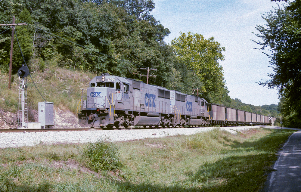
CSX’s gray and blue scheme from 1988 would become a stepping stone on the railroad’s journey to an attractive look for its locomotives. Called gray ghosts internally and stealth units by railfans, the solid gray from the frame up and blue below the frame was a cost-cutting measure from the initial CSX three-color design created in 1986. Concerns from the company’s claims department on visibility and a change in leadership at the top would morph this blah design into the very popular YN2 design that would adorn almost every locomotive in the fleet until YN3’s debut in 2002.
No. 2: Soo candy apple red
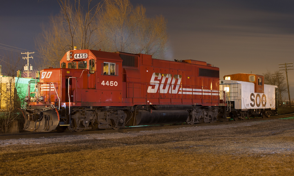
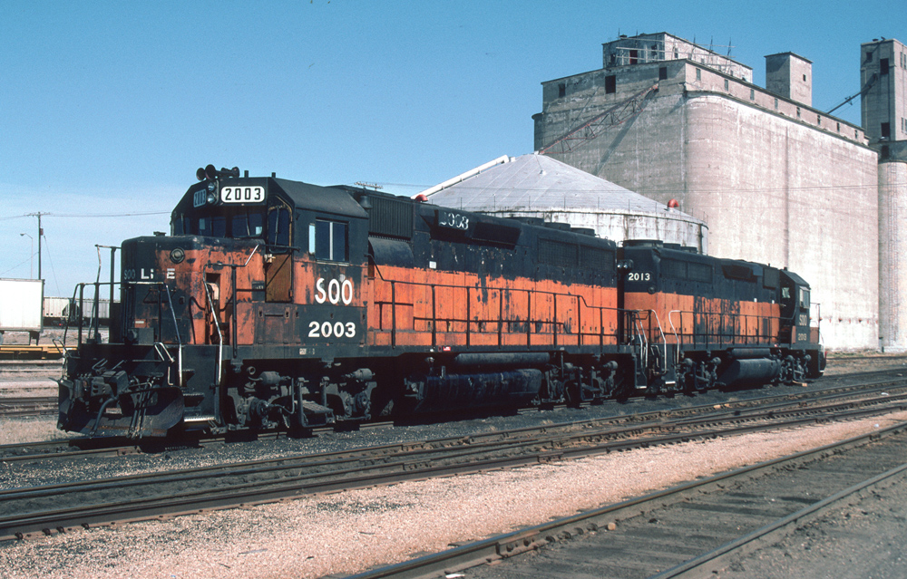
Soo Line’s classic gray and red scheme, first introduced in the early 1960s would come to an end in 1989 when management introduced the company’s new solid candy-apple-red scheme with more modern Soo lettering applied. Fortunately, this scheme would be short-lived, as CP Rail, who assumed full control of Soo Line in 1990, would introduce a new unified scheme for all its rail properties a few years after the new Soo Line design debuted.
No. 3: Burlington Northern’s executive scheme
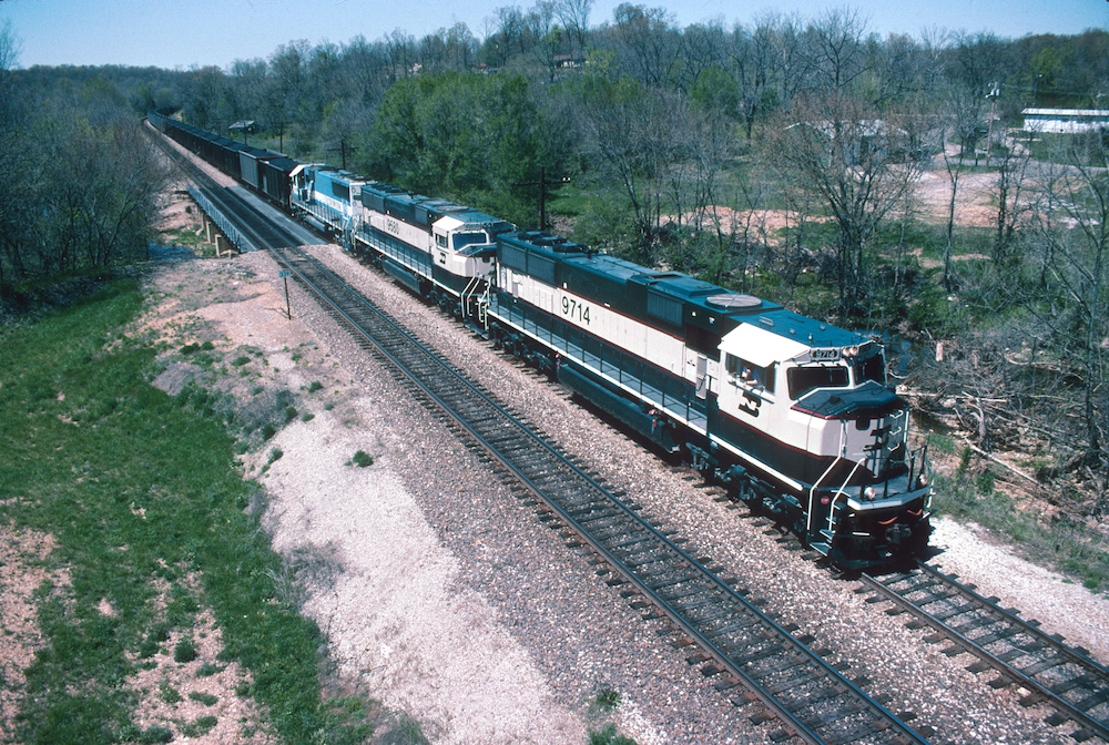
Burlington Northern took a bold step in 1990 when it brought in two F units from its maintenance of way to its West Burlington shop and made them into business train power. Less bold in many people’s opinion, including myself, was the cream and green colors they applied to the F units. It was a drastic departure from the railroad’s existing colors used since the railroad’s inception and would be applied to BN’s fleet of SD70MACs a few years later. Nicknamed Eddie Bauer’s after the outdoor company, the cream and green looked similar to many of the outfitter’s clothing items and the paint used on some special edition Eddie Bauer Ford vehicles beginning in the 1980s.
No. 4: BNSF 9647
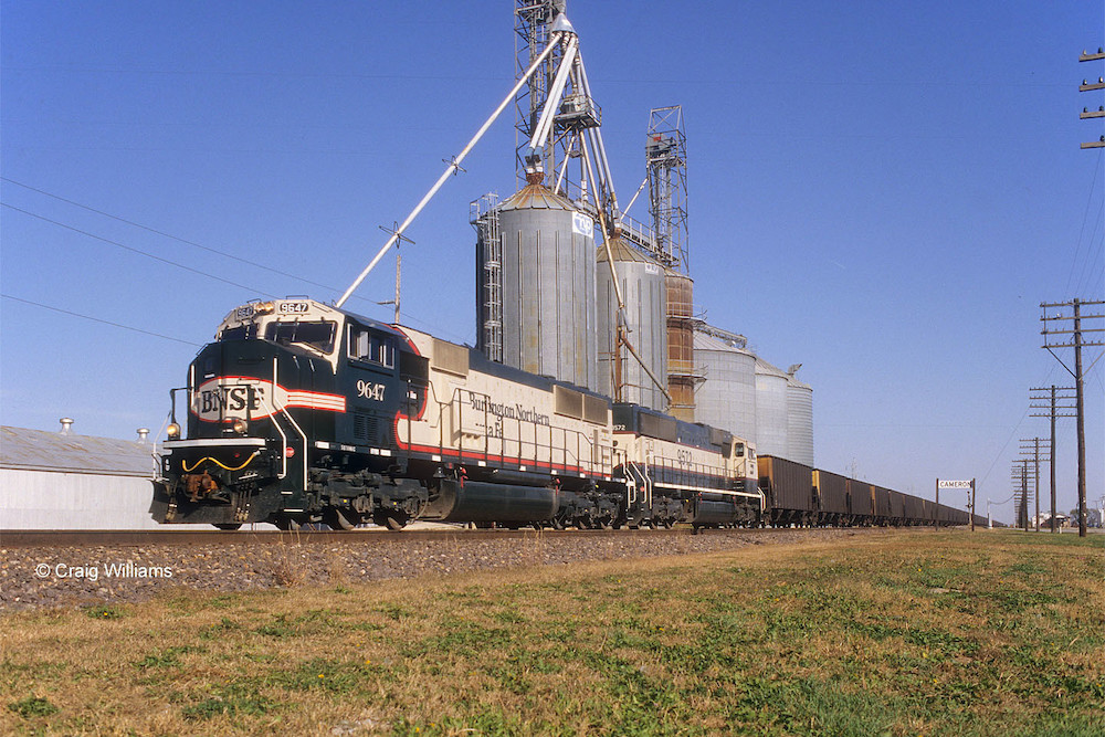
Shortly after the BNSF merger, the company began its search for the identity it would apply to the merged fleet of locomotives. It took a big swing and a miss with BNSF SD70MAC No. 9647 when it attempted to apply Burlington Northern’s cream and green colors to the Warbonnet design found on Santa Fe locomotives. Quickly nicknamed Barf Bonnet, the design would be the first of several design attempts by BNSF before settling on the orange and green colors that are far superior to the initial failed attempt.
No. 5: UP flag scheme
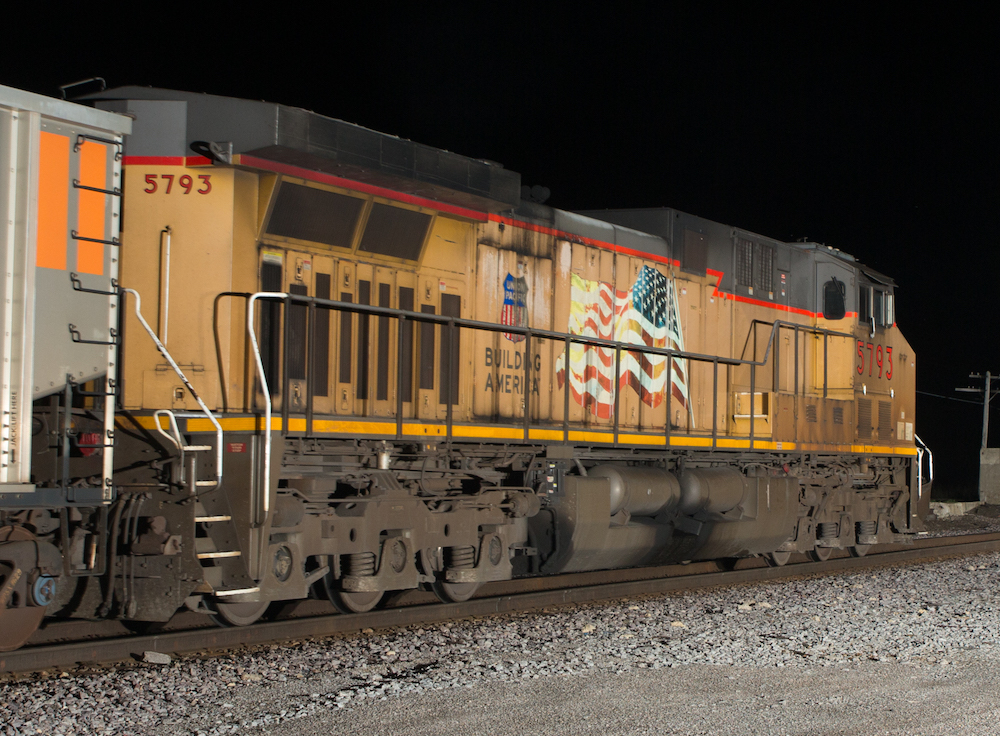
At the end of 2001, Union Pacific introduced a change to its locomotives with the addition of a waving flag and Building America slogan on the long hood of the locomotive. Unfortunately, the placement of the flag adjacent to the extremely hot prime mover inside caused many to become discolored, faded, or even burnt if an engine fire occurred. That coupled with the industry-wide trend to wash locomotives far less frequently often results in a heavy coat of dirt and grime over the flag. In the process, the corporate name was also relegated to the inside of the small UP shield, making it far less prominent on the massive road locomotives than before. In 2022, Union Pacific took action on employee feedback about poor flag conditions. The new design features a drastically reduced and relocated flag to the side of the nose on repainted locomotives and in the process, returning the Union Pacific lettering to its previous location on the long hood once again. I have an opinion about the wonderful wing logo that was removed when the flag was relocated, but I think that’s better left for another time.
Like this article? Read “Five locomotive paint schemes only a mother could love.”


ON the flip side, Iowa Interstate has one of the most beautiful paint schemes.
Throw in Penn central’s all black units along with today’s Norfolk Southern black units and I would also include SouthernPacific’s grey paint scheme with the red’ bloody nose front as paint schemes lacking in imagination and downright ugly As for classic paint schemes Sant Fe’s silver and red warbonnet design was one of the best along with Southern Pacifico’s classic red and orange Daylight paint scheme Aside from some Union Pacific designs that failed the test you have to admire them for sticking with the basic Armour yellow design and color on their diesels and passenger equipment and not making any radical changes or wild color or even drab paint schemes. Joseph C. Markfelder
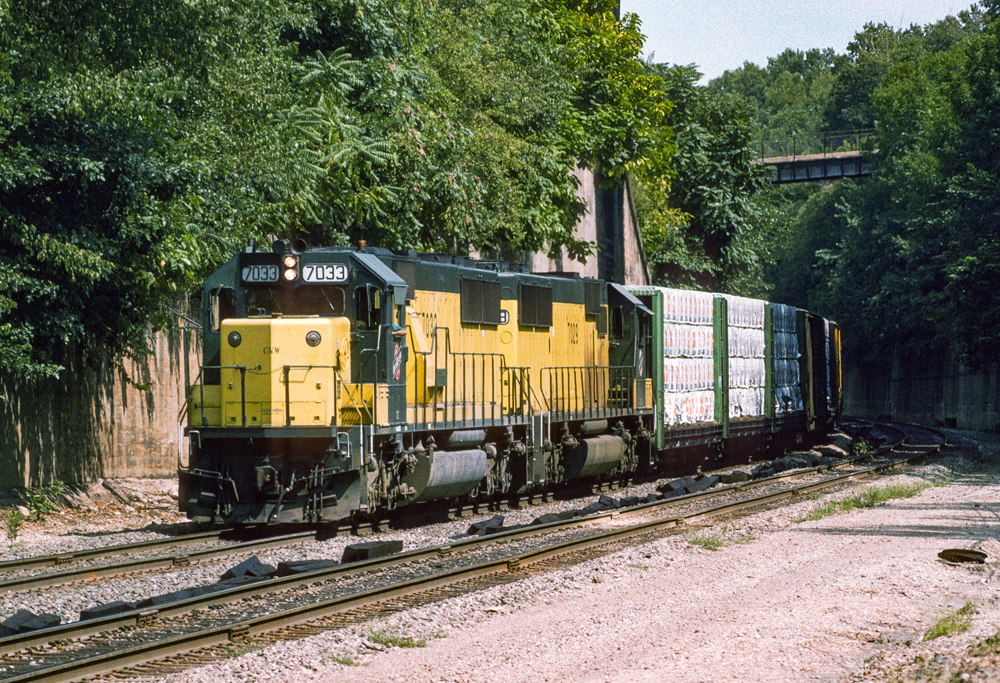
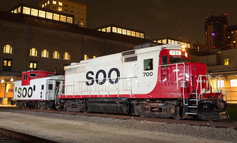
The red SOO is much better than the CNW’s new yellow
Add Acela 2 housepaint scheme to the list. Looks like it belongs on junk freight trains on a dying regional.
I like the “executive” theme BNSF units. Keeping them clean to show off the paint scheme is a different matter. A fellow member at my model railroad club calls my BNSF units “pumpkins.” SP”‘s “bloody nose” scheme was a bit boring coming after the “black widows” which was really good looking. I like the way UP remedied the flag situation too but bring back the wings! They were on my first Athearn train set, F7A and B units with a short freight consist.
I agree with the CSX stealth and the BNSF 9647.
The BNSF unit is a classic example of trying to please too many folks. On the other hand have always liked the BN executive scheme. Elegant not showy. I would have but the BNSF orange and black scheme (especially with the wedgy logo) on the worst list.
Then I generally don’t like any scheme with the American Flag on it. As soon as one paints a flag on a moving item it means at some point it will have the star field on the wrong side, be going backwards, or at least get dirty all of which violate the respect for flag code “4 U.S. Code § 8”. I know it is not quite the same as an actual flag but has always rubbed me wrong.
Grinstein Green is so far superior to current BNSF.
I dunno. I kinda liked the SOO candy apple red. It really stood out against a lot of backgrounds, and looked really good in full sun. I lived in the Southern Tier of NY for 18 years, including the time when CP took over the D&H, and saw a lot of these units there. It was always a treat to get one in the lead.
I also like the BN(BNSF) Grinstein scheme. I think it was, and is, an elegant color pattern. There are still quite a few running around-I saw BNSF 9790 in that scheme in Rio Puerco NM on the Transcon last week; still looked good. It’s a lot better than the “barf bonnet” 9647, which, admittedly was an experiment, but I’m glad BNSF didn’t adopt it for the fleet.
As for the CSX “Stealth” scheme, there’s nothing good to say about it. Not only uninspired, but poor grade crossing visibility in rain/fog. Glad they went to the yellow nose.
The UP flag scheme is a great one IF IT’S CLEAN!! There are a good many dirty/faded UP units running around, and they tend to look awful. I realize a dirty locomotive is just as effective at pulling trains as a clean one, but the image conveyed is not attractive.
To Michael Bellefontaine’s comment, I agree about the new CPKC scheme. I suppose there was going to be a change-the KCS scheme was the best looking one in North America, thank you Mike Haverty!!-but it was bound to change with the merger. They could have used more of the KCS colors in a new scheme. The bright side is, it will take a decade or more to repaint the fleet, and I bet some units never get done. So we’ll be seeing Belles for the forseeable future. As it is, we’re seeing mixed CP-KCS power on most trains here(I live in Arkansas on the KCS Heavener Sub), and it’s getting harder to find solid sets of Belles anymore.
Wait until you see the abortion colour scheme that my brother CPKC employees picked as the new colour scheme! We had four choices to choose from and of course, the colourblind majority picked the only one I couldn’t stand! ???
I’ll add one more that is bad but for a different reason…
Genesee & Wyoming…. their corporate colors killing off cool and interesting short line and Class II and III heritage. Roads like Bay Line.
What? No Family Lines … Those were more boring and gross than the CSX Stealth schemes.
Agree with CSX, SOO, and UP schemes, but I like both the BN and the BNSF ones. I do not care for the current BNSF scheme. Both it and the UP schemes show a lot of dirt and fading. The BNSF scheme used on four motor older units is much better, at least when clean.
Poor take stealth grey is goated. And the executive scheme is also one of the best. Extremely bad take