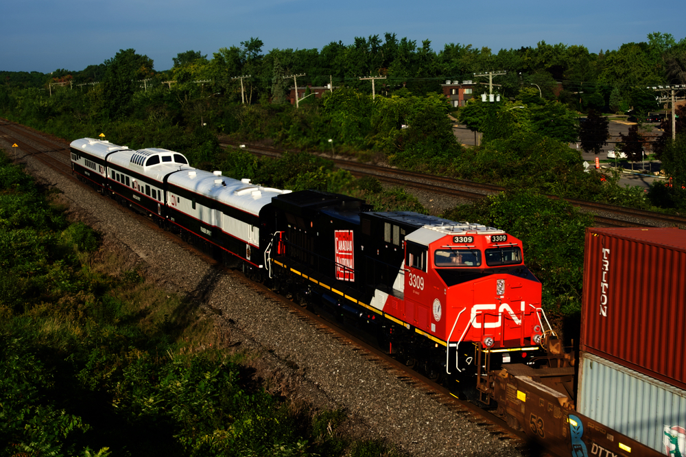
Canadian National AC44C6M No. 3309, which was rebuilt at the Wabtec plant in Fort Worth last year, now sports the railway’s steam era logo on its long hood.
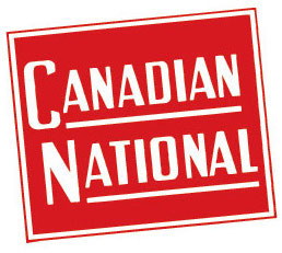
It was not immediately clear if the revival of the logo on the 3309’s flanks is a one-off or part of a broader salute to the logo that made its debut on steam locomotive tenders in 1923. A CN spokesman did not respond to an email seeking additional details on Monday.
The wafer logo was a riff on the Grand Trunk’s emblem at the time. CN, which was created in 1919 after the government nationalized the bankrupt Canadian Northern and other railways, adopted the logo after Grand Trunk officially joined the system in 1923.





It’s truly fascinating to see how Canadian National has revived its century-old ‘wafer’ logo on the Wabtec rebuild. This iconic logo not only represents a rich historical heritage but also symbolizes resilience and evolution – qualities essential in both sports and business. Just like athletes adapt and refine their techniques over time, businesses, too, must innovate and reintroduce elements from their past to stay relevant in the ever-changing market. The revival of this logo is a testament to the importance of honoring tradition while embracing modernity, a lesson that resonates in the world of sports where legacy and innovation often go hand in hand. Kudos to Canadian National for this thoughtful nod to its history, reminding us all that in both business and sports, honoring our roots can inspire remarkable new journeys.
Looks great to me. Very easy to see how the CN “Wet Noodle” evolved from that design on steam locomotives.
Very nice blast to the past!
I like it too. In English and French Canadien
ArrOOoo!
Might it look better without the noodle on the front end?
I like the retro look now appearing on locomotives. The heritage units on Metra and others are really nice and a break from the “same-old”.
They are trying to remember a time before Jim Vena’s mentor destroyed that railroad like Vena means to do to Union Pacific.
A meaningful salute to the past as CN continues to roll proudly on the rails.
Dr. Güntürk Üstün
Nice revival. But, shouldn’t it be gold lettering on a green field?
I also like. It would be great to see it on all units. I feel it would brighten up the hood of the unit, and spells the name out.
Spells the name out in English only. Barely legal in Canada. But yes I like it a lot.
Am I correct that the difference is only one letter (Canadian vs, Canadien)? If so, one side English, one side in French.
That’s correct George, one letter is the only difference.
I’ll be shocked if it is not French on the other side.
Was that way on box cars, “Canadien National” on one side, “Canadian National” on the other. Best as I know this heritage logo (subject of this article) only comes in English.
Grand Trunk Western, Grand Trunk, DWP, and CV, all headquartered in Detroit, used English only.
I think the laws may have been relaxed. The language-neutral “CP Rail” decades ago, “Canadian Pacific” more recently.
I have a vague memory of being in the men’s room of a VIA train in one of those ubiquitous (at the time, now retired) CNR coaches. It was spelled out something like “Chemins de fer nationals du Canda”.
Some things don’t translate well, which is one of the reasons why “Maple Leaf Forever” isn’t the national anthem, though it’s a great song.
I think your correct Charles about only English way back then, before the Official Languages Act.
But in the politically correct world of today, we’ll either have to wait for a picture or someone to clarify.
Too bad I wasn’t trackside when it came through here, I would have been on the conductor’s side.
I like it.