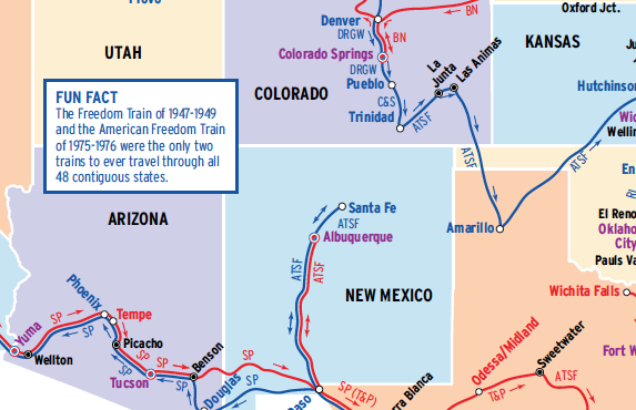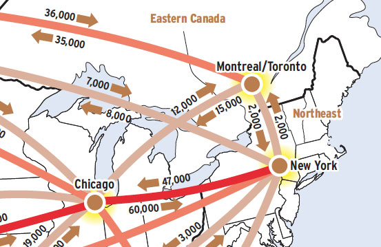
This Map of the Month was featured in the August 2004 issue of Trains magazine.
This map shows a commodity flow, or what everyone treats as a commodity flow: the trailers and containers that move in intermodal lanes in the U.S. and Canada. These boxes might actually contain anything from hay to helicopter parts, but almost no useable, comprehensive data exists at that level of detail, so “intermodal” is considered a commodity, like “coal” or “chemicals,” even though it’s just an aluminum box.
The lanes shown on this map account for most of the intermodal traffic in the U.S. and Canada, save for a few interregional lanes. Some key observations arise:
- A few of the lanes have most of the traffic. The 4,000 boxes that moved monthly in 2004 between the Pacific Northwest and Rocky Mountain regions equal 66 boxes a day each way, not a number that anyone would notice if it all came back onto the Interstate. That 5,500 box per day move between Los Angeles and Chicago, on the other hand, is truly staggering.
- Intermodal doesn’t move short distances. One thousand miles historically was about the minimum, although that number is shrinking every year, as fuel costs rise, truckers grapple with driver shortages and highway congestion, and ocean ports handle more containers.
- There are few intermodal nodes of consequence. The nodes on the map represent Vancouver, Seattle, Los Angeles, Denver, Dallas-Fort Worth, Chicago, Atlanta, New York, and Montreal/Toronto. All the rest practically can be counted on both hands.
- Only a fraction of the North American rail network matters to this business. You could abandon the rest of the network right down to what’s shown here, allowing for a few parallel routes, and the intermodal people would probably not miss any of it. It would improve their service, too.
- The imbalance of loads is difficult to explain. Intermodal is best suited to a consistent, everyday pattern of loads both ways. Empty moves of westbound containers or seasonal variation may account for the difference, but little data exists.
- Empty containers were, in the early 2000s, the dirty little secret of the business. New Jersey, the end of the road from China, had been where empties tend to become stranded, and it has mountains of them. More recently, demand for export grain has been sending more loaded containers back overseas.
Readers of this magazine often are surprised to learn how little is known about commodity flows. Each individual flow is known to the actors involved, but they can’t tell you about anyone else’s flow. At the other end of the scale, the Association of American Railroads can tell you total ton-miles. But it’s all the information in between that’s almost beyond human comprehension. Describing where every carload went last week, how it got there, what it hauled, and how long it took to get there, is like standing above an anthill and describing the pattern of the ants deep inside.
A caution: The total revenue moves shown on this map are developed from observation and data streams that have many obvious discrepancies. It’s possible that the totals shown are significantly smaller than the reality. The relative size of each lane, however, probably is reliable.