Like other companies doing business in a competitive marketplace, the railroads used advertising to create a public image of their railroad that could be used to sell their services. Typically, that image was succinctly captured in a slogan – some memorable word or phrase – or an iconographic trademark, called a herald in earlier days but now typically referred to as a logo. Both heralds and slogans were emblazoned in bold letters on the sides of freight cars, featured prominently on the pages of public timetables and travel brochures, and even stenciled on the sides of bridges.
As with any kind of product, the most successful railroad advertisements have stood the test of time, remaining in the consciousness of enthusiasts long after the roads themselves faded into the past. Here is a look at some of the most memorable railroad advertising slogans and logos.
Eastern roads
Competition between railroads was fierce in the eastern U.S., where many carriers served the region’s populated cities. Between New York City and Buffalo, for example, no fewer than five railroads vied for traffic.
No fiercer rail competition existed in the East than the rivalry between the Pennsylvania Railroad and the New York Central, particularly for passenger traffic between New York and Chicago. Pennsy had the shorter route, meeting the Allegheny Mountains head on, while New York Central followed rivers and lakeshores around the mountains, making up in speed what it lacked in distance.
New York Central timetables and advertisements heavily promoted its routing as one particularly favorable for travelers on its long-distance trains. The “Water Level Route – You Can Sleep” was Central’s memorable reference to its smooth, scenic route along the Hudson and Mohawk Rivers, and through the Great Lakes region.
The Pennsylvania Railroad for a time billed itself as “The Standard Railroad of the World.” Both Pennsy’s name and logo hearkened to the Keystone state.
Eastern carrier Baltimore & Ohio also used its route as the basis for a slogan, matter-of-factly proclaiming it was in the business of “Linking 13 Great States with the Nation.”
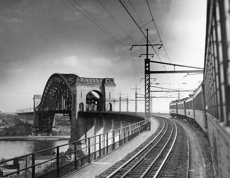
The New Haven Railroad, which in later years found itself in competition not with other railroads, but with trucks and motorists on parallel New England highways, used clever phrases developed in-house by the railroad’s publicity department to get people’s attention. Billboards advertising New Haven’s passenger service appeared frequently in towns the railroad passed through, and girder bridges over busy highways were lettered with the slogan “Train Yourself to Relax.”
In earlier years, burgeoning communities competed with each other to attract new railroads to their borders. One such competition created one of the most enduring railroad nicknames of all time. In 1881, the central Ohio towns of Bellevue, Norwalk, and New London all campaigned vigorously to be located on the main line of the under-construction New York, Chicago & St. Louis railroad. Local newspapers fueled the debate, stressing the railroad’s economic importance to whichever town was chosen. In several articles, the Norwalk Chronicle began referring to the new railroad as “the great New York and St. Louis double-track nickel-plated railroad,” nickel-plated meaning an exemplary operation. The railroad soon began officially referring to itself as the Nickel Plate (later Nickel Plate Road), although it was the town of Bellevue, not Norwalk, that eventually hosted the railroad’s right of way and division headquarters.
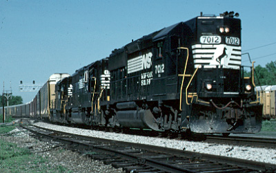
Midwestern railroads make connections
Midwestern carriers, which didn’t have the reach of big Western roads or serve the multitude of large cities found in the East, competed for overhead traffic while developing on-line business. Grain was a huge staple of many railroads. Not surprisingly, their slogans often played up their role as a bridge route and their connections with other carriers.
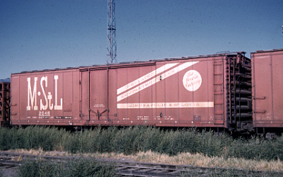
Minneapolis & St. Louis’s rolling stock was lettered “The Peoria Gateway,” while Illinois Central adopted the slogan “Main Line of Mid-America.” The Chicago, Rock Island & Pacific was commonly shortened to the “Rock Island Line.” Akron, Canton & Youngstown was “Ohio’s Road of Service.”
Missouri Pacific freight cars were lettered “Route of the Eagles,” referring to its fleet of streamlined passengers trains that shuttled passengers between the Midwest and southwest.
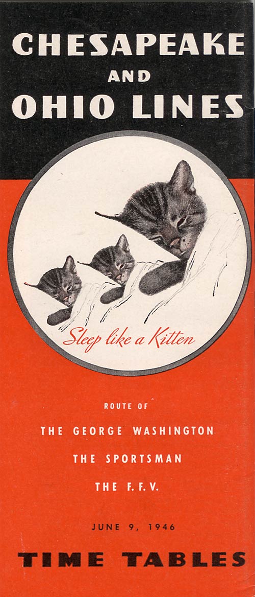
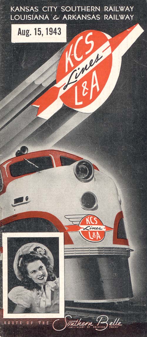
In 1940, Kansas City Southern (KCS) inaugurated its “Southern Belle” passenger train between Kansas City and New Orleans. Along with the event, KCS sponsored a beauty contest to promote the train. An 18-year-old Baton Rouge, La., girl, Margaret Landry, became “Miss Southern Belle.” Miss Landry became the spokeswoman for the new train, and was pictured on KCS timetable covers.
Other slogans promoted a carrier’s service. Missouri-Kansas-Texas (MKT) used “Count on Katy.” In the 1930s and ’40s, the Alton Railroad between Chicago, St. Louis, and Kansas City was “The Only Way.”
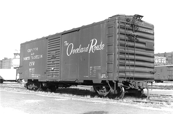
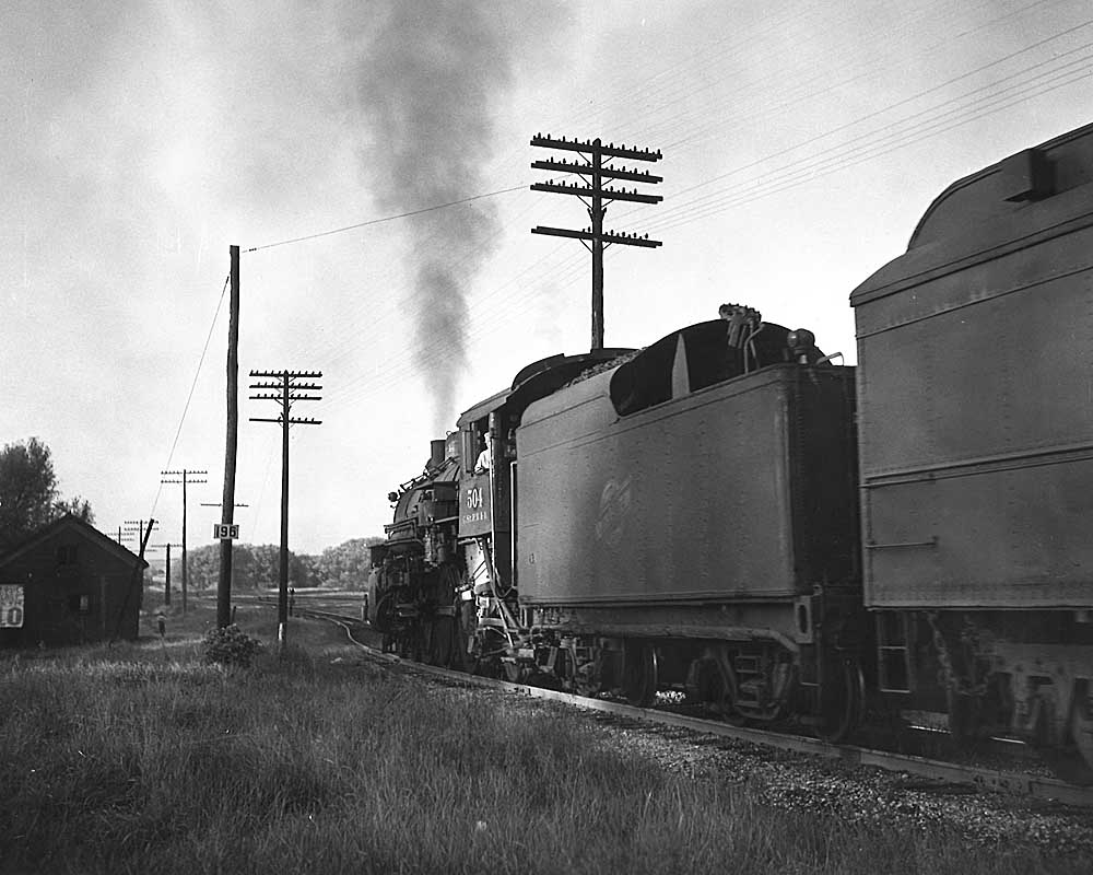
Chicago & North Western stenciled “The Overland Route” on its boxcars, to promote its favorable connection with Union Pacific at Council Bluffs, Iowa, and Fremont, Nebraska.
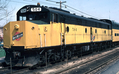
C&NW wasn’t the only transportation company to play up its ownership status in promotional material. United Airlines did the same after its own 1994 restructuring, which created the largest majority employee-owned company in the world.
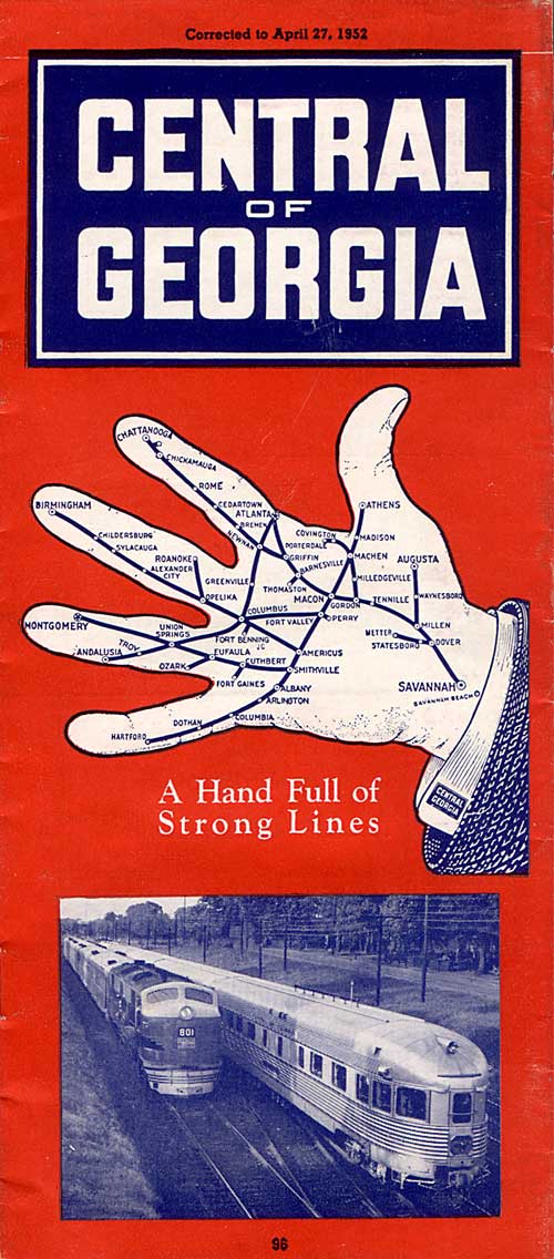
The Central of Georgia Railway operated a collection of strategic bridge routes throughout the Southeast that, when viewed on a map, extended from Savannah like the fingers on a hand. CofG capitalized on this imagery, and public timetables showed an open hand with the words, “A Hand Full of Strong Lines.”
Clinchfield promoted its fast, low-grade main line through the Blue Ridge Mountains with a herald that proclaimed “Quick service-short route; Central West & Southeast.”
Seaboard Railway had a circular logo that contained a heart with the words “Through the Heart of the South.” Nashville, Chattanooga, and St. Louis used the slogan “The Dixie Line.” Bridge line Richmond, Fredericksburg & Potomac reminded customers it was “Linking North and South.”
Southern Railway used the rhythmic “Southern Serves the South.” In later years it adopted the slogan “Southern Gives a Green Light to Innovations,” with the “O” in Southern colored in to represent a green signal – a slogan appropriate for the railroad that in the 1950s and ’60s embraced mechanization, introduced unit coal trains and new freight cars, and understood the power of marketing.
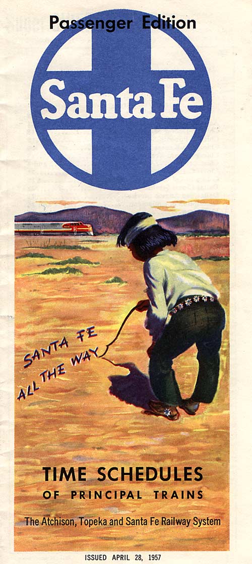
One of the most famous trademarks in railroading was Santa Fe’s cross and circle emblem, developed in 1901 by passenger agent J.J. Byrne. It was reported the emblem symbolized the four points of the compass, surrounded by the wheels of transportation with the words “Santa Fe” in the center.
When Santa Fe and Burlington Northern merged in 1995, the new Burlington Northern Santa Fe Railway adopted a modified version of the Santa Fe compass as its corporate logo, carrying a tangible symbol of the past into the future.
In the mid-20th century, Santa Fe introduced a series of slogans that promoted is single-line service between Chicago and California. “Santa Fe All The Way” was first used in 1940, followed by “Ship and Travel Santa Fe All The Way” in 1947. Combining such words with the red-and-silver diesel colors and “Chico” the fictional mascot, Santa Fe effectively created a complete image to help sell transportation.
The Great Northern and Northern Pacific both competed for traffic between the Midwest and Pacific Northwest, but the images used to promote their services were radically different.
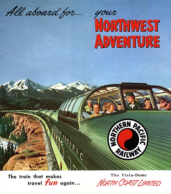
(One could also view the distinctive image as a symbolic representation of the overseas trade that contributed to the railroad’s traffic base – surely good luck for NP’s accountants!)
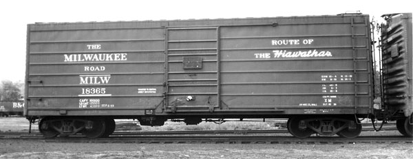
Western Pacific, partners in California Zephyr operations, ran the train through the spectacular Feather River Canyon in northeastern California, earning the title “Feather River Route.”
In the 1970s, Milwaukee Road emblazoned “America’s Resourceful Railroad” in bold, black letters on its yellow hopper cars.
Southern Pacific’s Sunset Medallion can be traced to 1876, when SP employee N.R. Olcott drew the original Medallion showing a pair of railroad tracks headed west towards a blazing sunset. The center bar originally carried the words “Sunset Route,” “Ogden Route,” “Shasta Route,” or a combination of the three, depending on the advertising effect desired. By 1915, the design had been simplified to read “Southern Pacific Lines,” and in 1923, the Medallion was registered with the State of California as the official trademark of the Southern Pacific Company.
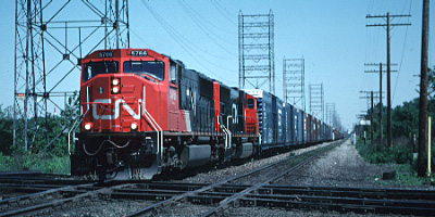
After investing nearly $2 billion in new equipment, technology, and services in the 1950s, Canadian National embarked on a visual redesign program that modernized the look of everything from the paint scheme of its engines to the uniforms worn by employees in its chain of hotels. Today, this kind of marketing effort would be called a rebranding.
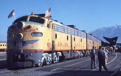
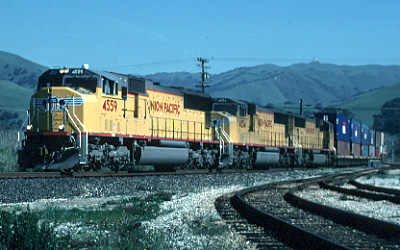
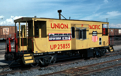
In 1939, a new art deco variation of the logo featuring a pair of wings was introduced on an E3A diesel locomotive, purchased for the railroad’s City streamlined passenger trains. The wings soon became a standard fixture on all of UP’s cab units.
Today, Union Pacific is returning the winged shield emblem to its current locomotive fleet, and – in a striking example of modern marketing – is the only railroad to stencil its web site, www.uprr.com, on the sides of its engines. Emblazoned with blue wings sweeping back from the red, white and blue shield, Union Pacific
gets high visibility in the new millennium.
Special thanks to the following individuals and organizations for help with this article. The Santa Fe Railway Historical & Modeling Society and their excellent book Trademarks of the Santa Fe Railway; New Haven Railroad Historical and Technical Association (Marc Frattasio); C&NW Historical Society (Joe Piersen); Fred Wallace, Columbus, Texas (Southern Pacific locomotive engineer-retired).


Left out of the discussion was the Hatter rebranding of the New Haven, and later the Boston and Maine after McGinnis took control. The is a book The New Haven in the McGinnis Years from the New Haven Railroad Historical Society that cover the subject and includes the B&M rebranding.