There’s a lot of behind-the-scenes-work to make the cover of Classic Toy Trains. Here’s an inside look into how the image came about for the Jul-August 2023 issue.
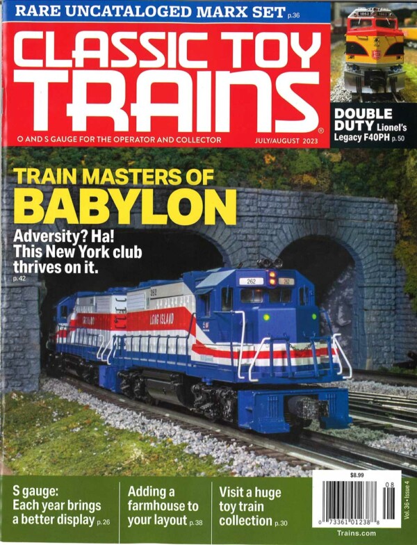
The feature story showcases the 41×60-foot O gauge layout built by the Train Masters of Babylon club in Farmingdale, N.Y. The image, shot by Kalmbach Media Co.’s Ben Lake, spotlights a pair of K-Line GP38-2 models.
The cover of Classic Toy Trains
The club would have been highlighted in the pages of CTT sooner if not for two natural disasters. First, the Covid pandemic made it impossible to visit for more than two years. Then, when photographer Dennis Brennan and I were able to travel to Long Island in August 2021, a hurricane forced us to cancel our visit at the last minute.
Ben Lake and I had been looking forward to visiting the Train Masters of Babylon, as committed and as hospitable a group of O gauge modelers as you’ll find. By the time we arrived at the club’s building in August 2022, I’d been working with some of the officers for almost five years to make the article happen.
Once we walked in, finding a cover shot was our main priority. The other photos could wait. Consequently, Ben and I spent several minutes simply walking around the huge O gauge display.
We made it a point to walk separately, heading off in different directions to explore all the scenes on the different levels. Fortunately, we have similar perspectives when it comes to understanding what makes a dynamite cover shot.
The other person involved in the process is CTT Art Director Lisa Schroeder. She’s made a lot of covers over the years and knows just how an image must fit to accommodate the elements that need to be there.
What spot?
As readers of the July-August issue know, the TMB has a terrific layout with lots of great scenes. One Ben and I liked is the station area the club’s Pat Nardella photographed for the article’s lead photo on pages 42-43. The tall trestles found in several places, notably the elevated logging line (page 47) also caught our attention.
But a great “scene” isn’t necessarily best for the cover. Lisa and CTT Editor Hal Miller like pictures with a single point of focus. Ben and I needed minimal scenic elements surrounding the main subject focal point. He reminded me he also needed to get close to the track at an angle where the engine looks like it’s heading straight at him.
These requirements eliminated the station scene and elevated lines. They also ruled out certain industrial spots and the town nearby where there was just too much going on. However, we both liked the spot where there was a tunnel at the edge of a large mountain covered with brush.
Learn how to make great model railroad scenes.
The last detail
What locomotives were going to be in the picture? Because the club is on Long Island and members often bring modern-era trains decorated for the Long Island Rail Road to run, I preferred diesels with that road name.
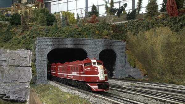
To be on the safe side, though, we tried a few other possibilities. One was diesels in the New York, New Haven & Hartford’s white-orange-black “McGinnis” paint scheme. Another was a set of MTH Alco DL-109s lettered for the Cranberry, a New Haven train that had served the Boston to Cape Cod route. That picture, presented here, was my favorite.
Neither captured the “hometown” railroad feel of the LIRR units. Plus, as the issue was coming out around Independence Day, the red, white, and blue units were particularly appropriate.
Well, now you know almost everything it takes to photograph and design a cover for the front of CTT. This knowledge will help you appreciate more fully how editors, artists, photographers, and layout owners collaborate to present the very best picture for you.


