This is not the first layout members of the SDGRS have built for Children’s Hospital. The first was opened back in January of 1994. That layout faithfully served its purpose for many years, but eventually wore out in spite of ongoing maintenance. Frankly, it was dirty and far too noisy. We began receiving complaints from the hospital’s staff and they quit running it.
The new layout
After hosting the 16th National Garden Railway Convention in 2000, the SDGRS board of directors and convention committee considered ideas regarding what should be done with the proceeds we had realized from the convention. Among other things, it was decided that the hospital’s layout either be refurbished or completely rebuilt. Bob Treat, an award-winning art director, volunteered to come up with a design and present it at an upcoming board meeting.
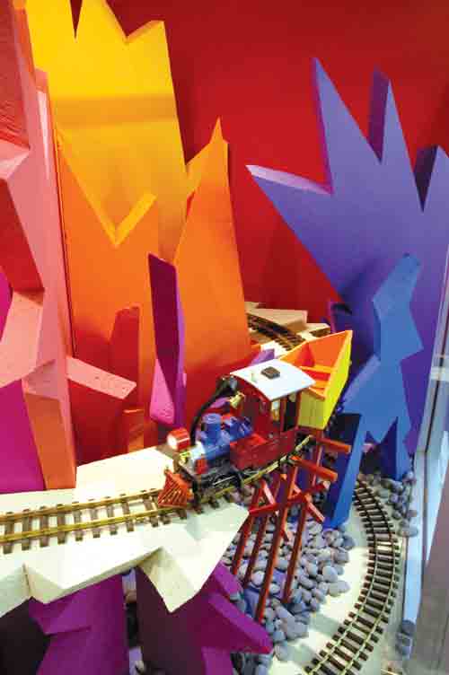
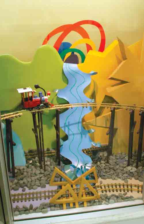
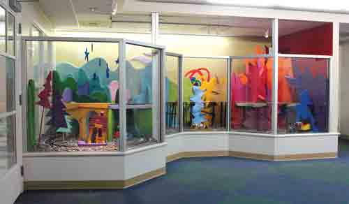
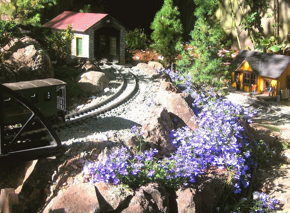
Bob’s design was totally different from the original layout. It was pure whimsy and fantasy. Furthermore, this design had a specific purpose. His concept was that the layout would represent a journey from an apprehensive, rocky area to a calming, pastoral area, much like what the children at the hospital go through. Trains would travel through the entire color spectrum, from the jagged red and purple mountains to the rolling green and blue hills. Bob’s concept and design were unanimously approved and he was given the go-ahead to complete the project.
Construction
Prior to building the new layout, the old one was demolished in order to meet the requirements of both the new design and current building and fire codes. This required the use of materials that had to be approved by the hospital administration and building supervisors. Bob enlisted the help of Mike Pfulb, Ken Sommermeyer, and myself to tear down the old structure and build the new one.
Once the demolition was complete and new construction begun, specific materials had to be located that would meet codes. Framing had to be fire retardant and all the scenery forms were made from specially ordered, extruded polystyrene foam. Once the foam arrived, Bob cut and carved all the forms into the scenery profiles he had envisioned. All of these needed to be painted with Bob’s unique pallette of colors. Bob invited Sue Piper, Dick Dale, J. Rennilson, and myself to nightly painting parties.
Since the radiology department is in operation every day, all construction and painting had to be done at night and during weekends. To facilitate the work, as much as possible was done off site.
Trains and structures
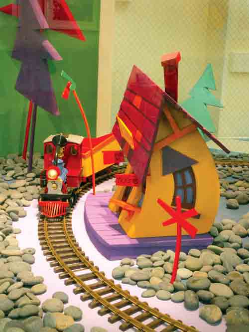
Not just any train, structure, or bridge could be used on this layout. Bob wanted a whimsical theme to be used throughout. Locomotives and rolling stock were either severely kitbashed or scratchbuilt, then painted in fantastically bright colors. The same went for the little depot and trestle over the waterfall.
The layout was completed in late December, 2005. It is operated by means of a specially designed electronic eye devised by Mike Pfulb. The beam is set at approximately 10 feet away from the layout so that a passing child (or adult) will break the plane and set the train in motion for 15 seconds.
Conclusion
This project has been very rewarding to all of those involved. It’s amazing to watch the change of expression of not only the patients, but their parents and members of the hospital’s staff when they see those whimsical trains trundle through an equally unique and magical countryside.




https://www.charlestoncitypaper.com/charleston/the-itinerant-literate-is-taking-a-mobile-approach-to-bookselling/Content?oid=5263430