Design in the garden is a process. We first design the trackplan and give it a platform with hardscaping (April 2017). Next, we outline where focal points will go (June 2017). Now, you as the designer can incorporate the finishing touches using classic art principles as a guide.
In this last part of our design series, 10 landscape-design axioms illustrate ways to pull together elements by association. “Pairings,” like wine and cheese, complete your garden railway palate. See how designers from eastern Canada to western California have compared and contrasted just two elements at a time to help us notice the story and sense the harmony.
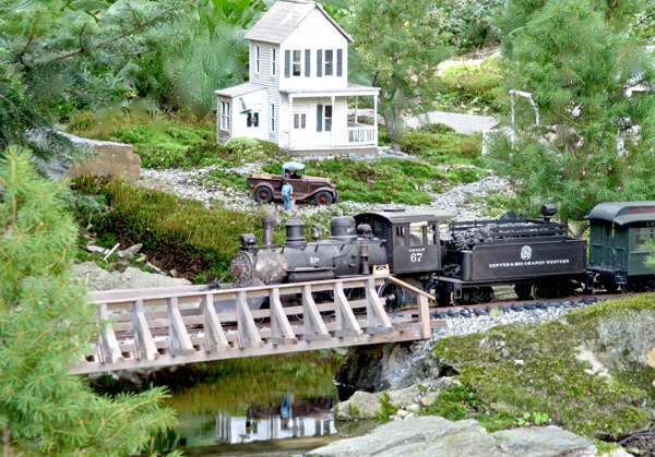
1. Mirrors and repetition. The concept of “less is more” means that fewer types of elements are repeated to actively de-clutter and unify your landscape. Gray gravel logically surrounds gray bedrock (photo 1). Still water magically reflects the farmhouse. Scott Gould paired the truck with a truck farmer, ready to deliver his produce. Should you choose to graze three deer nearby, group two together compared to a third opposite them to make an irregular, less-static triangle than one with equidistant spacing (see Julie Barber’s depot platform in “Regional reports”).
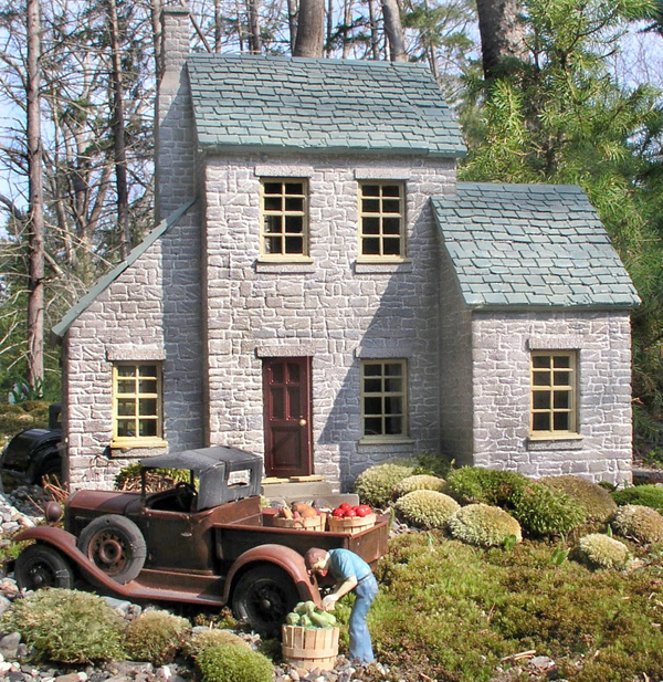
2. The allure of logic. Later, the Goulds’ 1:19-scale farmer delivers fresh veggies to a neighbor in a beautiful “stone” house in photo 2. All elements, from the borrowed view of the 1:1 forest behind the house down to the action of a single figure, present us with the view of a lifestyle—no words are needed. When Scott consulted the Genius of the Place (“Design…” April, 2017) in forested coastal Maine, it answered, “Moss!” Two types of moss create both the scale lawn and the tidy foundation shrubbery. Peace.
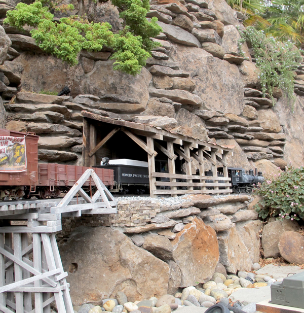
3. Form follows function. In architecture, photography, high art, and garden design, three components help to balance the composition: line, focal point, and filler. In the railway, our bridges, track, and buildings form lines, as do tall trees. Photo 3 shows F. John LaBarba’s use of horizontal and vertical lines within his trestle, retaining wall, and bridge. The rocks also repeat horizontal lines, often in diagonal patterns, like the natural striations of an ancient cliff. Texture.
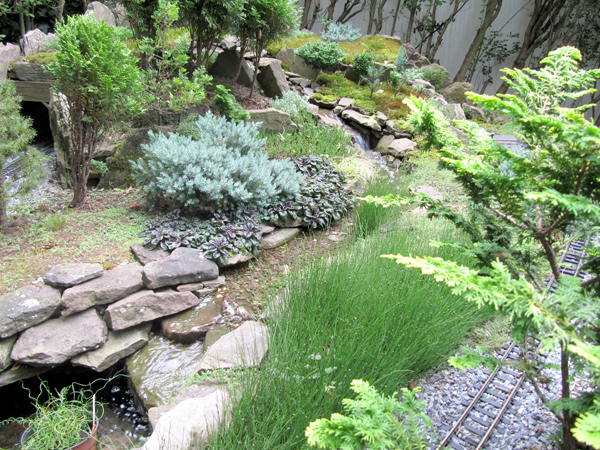
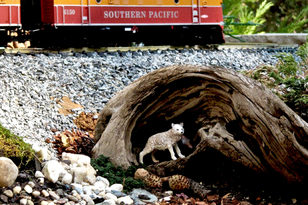
The continuous curving line of a gurgling stream guides our senses to naturally follow the action (photo 4). Ed Assaf’s field-and-stream scene captivates our attention as we wonder where it goes. Curves, zigzags, and radial lines add character. Ken and Nita Young use a natural spiral to zero-in on wary wildlife in photo 5.
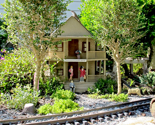
4. Patterns and symmetry. As much as our eyes love lines, they also seek patterns. Mentally, we outline the construction of buildings and bridges, while feeling the balance of level lines. Bonsai-inspired trees, sculpted like pagodas, lend structure to the garden with formal or leaning trunks and shelf-like branches. In photo 6, Doug Brainard landscapes a symmetrical boarding house with a pair of well-proportioned trees to shade guests waiting for the train.
5. Defy gravity. In the garden we see up-and-down or horizontal lines as man made (fences and rooflines), and they’re more static than diagonals of any degree. On a slope, position two items so they form a diagonal; if placed in the same vertical or horizontal plane, one takes away from the other. With the exception of photo 6, which shows height in trees, all these photos exhibit some elevation, however slight—a feature that allows much juxtaposition of components that are not smack dab in front of one another, but skewed to the side. Movement without motion.
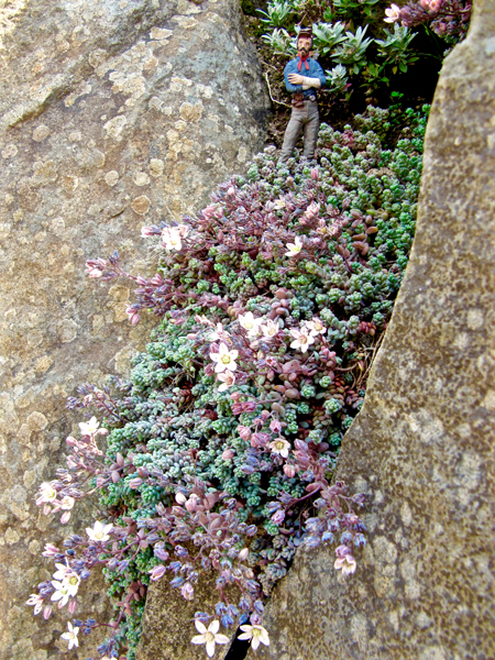
6. Filaments fill and fuse. Extend the scenery. Grow little alpine plants in some of the cracks of your retaining wall, planting two or three species to see which ones work best. Jonette and Gary Lee filled a diagonal space between massive boulders with a weeping plant (Blue Tears stonecrop), punctuated by a scout on the lookout (photo 7). At first the rock appears flat but tiny flowers and gray-green leaves make us notice the mirrored, spotty lichen-texture of that rock.
All these designers furnish their scenes with filler elements to support the main theme with little reminders here and there—filaments that tie it all together. To finish the “full” look, cover the soil with low plants and fine-grained gravel or mulch, as in all these photos.
7. Complement and contrast. In photo 8, adding the stegosaurus to complement an equally gray and stubbly stonecrop also matches the gray, pocked volcanic boulders. Jack and Pauline Verducci planted filler of contrasting pink-blooming thyme to soften the rocks and add life, while matching the stonecrop’s pink stems. Subtle and sophisticated.
How do you combine all the scale plants to complement your garden? Variety is a delicate spice that can easily be muddied by too much of it. We horticulturists are tempted to make a home for all sorts of enticing plants. In photo 4, note how well Ed Assaf grouped groundcovers and narrow-leaved trees to contrast sizes (heavier ones lower), texture (coarse up front), and lively color combos. Then he tied them together by multiplying smaller versions farther away for depth and the sense of family in Nature.
8. Another perspective. Pair up with another designer to increase your shared skillsets. Pair chairs in viewing areas and be sure those two viewers have something to talk about! It’s okay to leave an unfinished scene—mount a tiny “under construction” sign in front of it and wait for the ideas to form. Or place a work vehicle and some hard-hatted workers there, paired with a specimen plant, as did Richard Murray (photo 9).
Your pair of ears can allow guests to share their fresh perspective. If you don’t agree with the “armchair designers,” just thank them for their interest or say “Good idea!” That gratitude keeps more ideas coming, some of which may make a world of difference in helping you design your world.
9. Depth perception. Depth of field could be the most difficult design concept. To encompass your mid-field focal points, use a background/mountain of rocks, fine-leaved trees, or mounds of shrubby juniper. It’s a game of comparison—big/coarse in front, small/fine in back.
We usually view gardens front to back, which creates the possibility of steering viewers to perceive miles of countryside within a few feet of ground. Set up our visual access so that we peer at scale wildlife between trees, read signs down Main Street, or sneak peaks at junk behind factories. In photo 10, Jim and Jackie Ditmer’s raised railway in autumn uses layers to trick our perception.
10. Do it your way. Lastly, allow for happy accidents. If you run out of rocks while building a wall or terrace, look around for something different to break that pattern for contrast—maybe a bridge spanning a slope of talus. No manual instructed the Youngs (photo 5) on how to pair the wolf with the hollowed knot of a tree. Inspiration.
In the end, strength of construction plus common-sense landscaping should curtail the need for redesigning after every rainstorm. In a garden where everything is miniature, one cannot say “Don’t sweat the small stuff.” What might help is the advice of experienced railway gardeners who finally got rid of much of that small stuff, leaving less to maintain. If your climate doesn’t support groundcovers, try decorative fine gravel and kill the sprouting weeds with inexpensive white vinegar (not Roundup, which can drift and kill good stuff). If you don’t like to prune trees, use low needle-leaf shrubs. Pair your talents with your hobby, but please, green it up a bit!
Regional gardening reports August 2017
Zones are USDA Hardiness Zones
What design tips help us to place figures and show perceived action?
Frank Lucas
Martinez, California, Zone 9
Get busy, people!
If you have little people in your diorama, please, please do not have them all facing one direction. I visited one railway a few years back where the owner was very proud of his 80 people, but all looked straight at me. They should be doing something or (even better) interacting.
• Miniature Garden Guidebook (Ch.3) “Design your miniature garden” https://kalmbachhobbystore.com/product/book/12444
• “Greening your railway: Sustainability for lasting enjoyment” (GR, Oct 2013)
• “Pathways: Garden design. . .magic is in the details” (GR, June 2007)


 pro
pro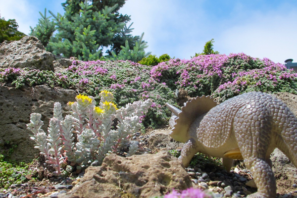
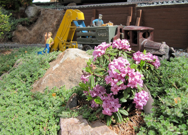
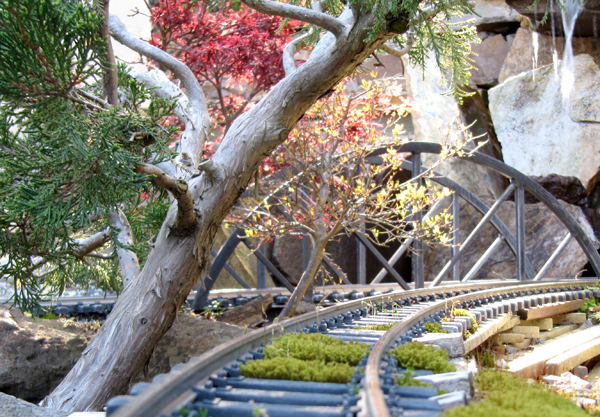
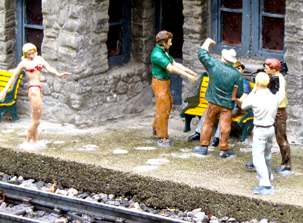





Photo 8 shows a Triceratops not a Stegosaurus. I hope it enjoyed the succulent!
Thank you, Mark, for correcting this inexperienced paleontologist 🙂