Designing structure interiors with artificial intelligence: Artificial Intelligence (AI) is a burgeoning tool with many possible uses. My last article on the topic, ChatGPT and the model railroad, explored the use of text-based chat tools like ChatGPT for model railroading purposes, including generating layout concepts. At the end of that article, I used an AI image generation program to test the capacity of AI image creation. That article utilized the free program Fotor, but found myself underwhelmed with the results.
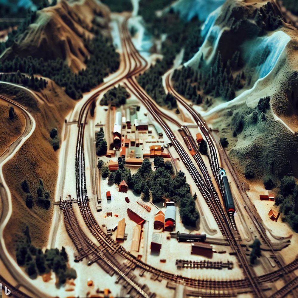
Having felt disappointed, I decided to try the same prompt, namely “Model railroad layout trackplan, birds eye view, HO scale, mountainous, with tunnel, mining operation and city” in a different program, this time opting to use Microsoft’s Bing Image Creator. This would serve as a litmus test, of sorts: Was the issue with the prompt, the program, or the technology itself?
The result was mostly similar to my previous results. I found that while at first glance the image was passably fitting the prompt, upon closer inspection one notices inconsistencies: tracks spurs attached to nothing and nonsensical structures chief among them.
Practically speaking, that is a purely theoretical prompt, though. The practical application for a model railroader, at least with those prompts, is limited at best. However, there are real use cases for AI image creation for model railroaders.
The use cases which interested me most were structure interiors. For one, the inside of a shop is something that the program will have a vast reference pool to pull from, meaning that the results I’ll get are likely to be higher quality. Additionally, it’s the sort of thing that’s easily accomplished with a flat image. Similarly, a modeler could use this technology to design advertisements, billboards, and other such signage for their layout, but for the sake of this article, I chose to focus on structure interiors.
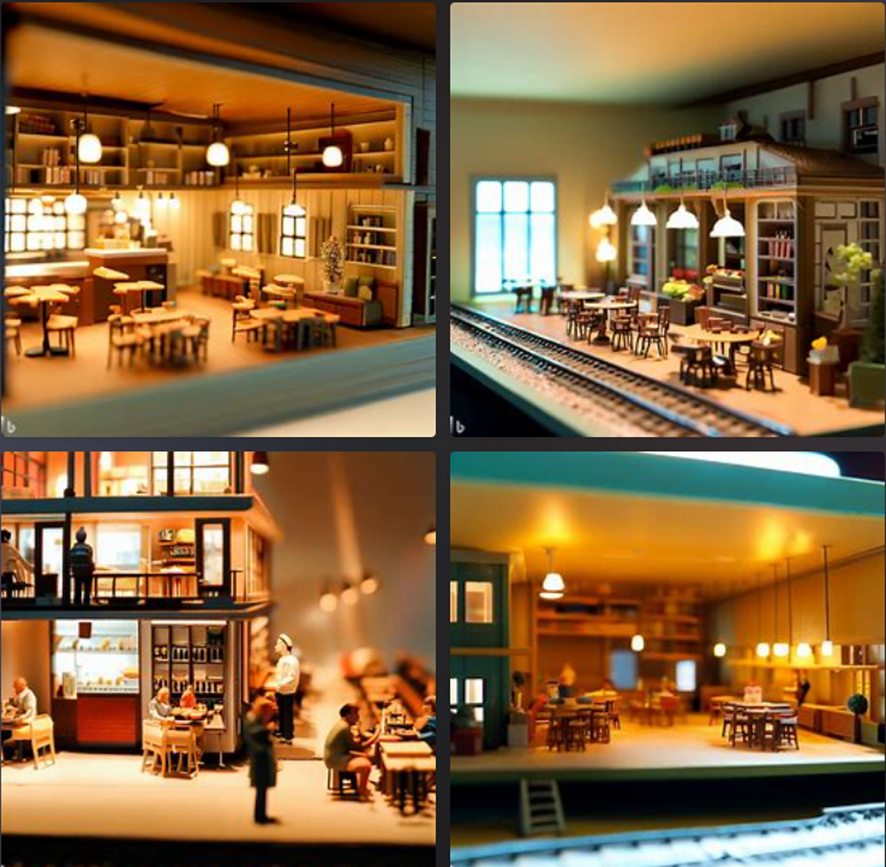
Again using Microsoft’s Bing Image Creator, I began with the prompt “Model railroad structure interior, HO scale, coffee shop, flat, modern”. With these prompts, one must toe the line between too vague and too specific. If not enough specificity is provided, the program often lacks the ability to create something detailed enough to pass muster. Similarly, if too much specificity is used, the program becomes overburdened and as a result provides cluttered, illegible images.
For the most part, these images aren’t quite what I was looking for. In the top right quadrant, the image has a coffee shop with a train track running through it – a misinterpretation of the prompt I provided. The same thing applies to the bottom right image, with a stretch of track running through a coffee shop in a different direction. In the bottom left quadrant, we see something more usable, at least at first glance. The angle is about right, and there’s no train tracks running through the inside of the building, but there appears to be a structure inside the building which is multiple stories tall, which wouldn’t suit a single-story building.
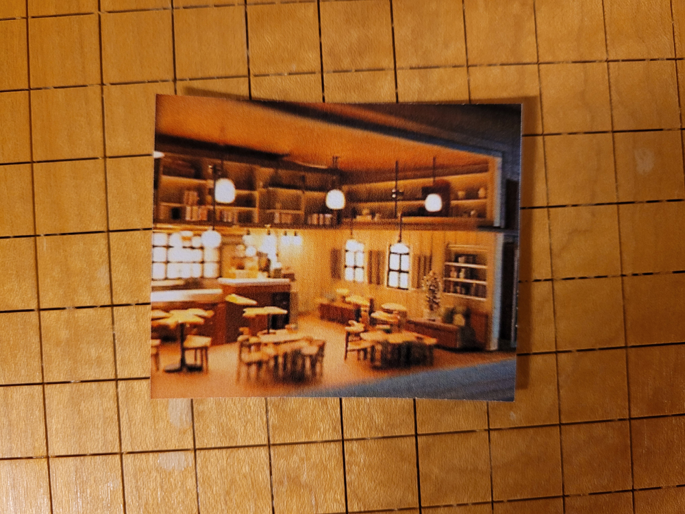
The image in the top left, though, is more usable. It’s not without its issues: for example, it’s at an odd angle which isn’t compatible with most structure interiors. Deciding that this was as good a place as any to start from, I then printed out the image, and cut it to fit. In my experience, these images worked best when printed in the range of 30% – 40% scale relative to their original size, but there’s no hard science to this, as the printing scale needed depends on the size of the image you’ve selected.
After trimming the image down to size, I then quickly inserted it into a blank storefront on our upcoming project layout, Freemont Mills, just to see how it would look.
Not bad! Not great either, though. After all, there’s always room for improvement. The window placement in the image makes even less sense now that it’s placed in a structure, and it’s more apparent that this interior is triangle-shaped, rather than the traditional four-walled structure I’m using here. With just a passing glance, it passes the eye test, but only just barely. A good start, but there’s more work to be done.
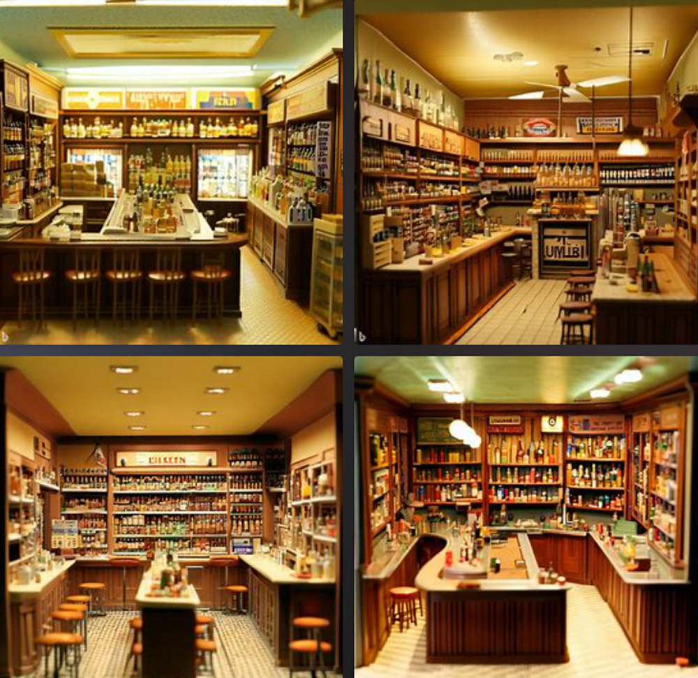
Wanting to change things up, I decided to generate a new prompt, using a different sort of business entirely. From the prompt “1970s liquor store interior for model railroad structure”, I got this batch of results:
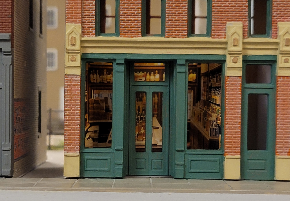
As you can see, we’re getting to usable results now. The perspective is right for the most part, with two side walls and a rear wall, no inaccurate window placements, and the era looks more or less appropriate according to the prompt. There does seem to be some confusion here between a bar and a liquor store, as all images generated in this batch feature bar stools, but it’s not too distracting. Wanting to see what this image looked like inside of structure, I selected the top left image and trimmed it to fit the same structure on our Freemont Mills layout.
Now we’re in business. To my eye, that’s a totally plausible, passable liquor store interior. The angle of things might not be perfect, but it is, as they say, “good enough.”
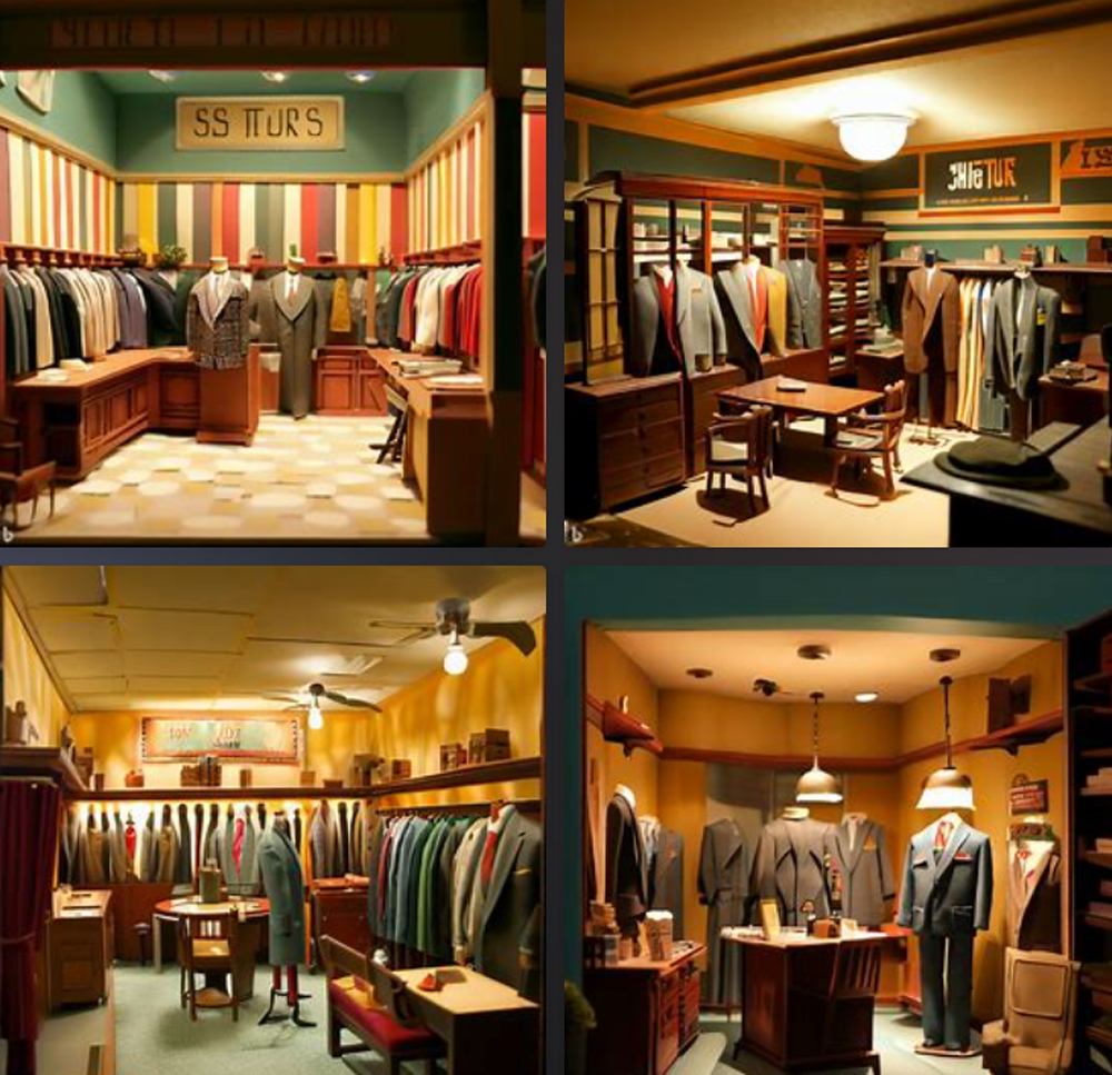
Finally, in an attempt to see if usable results are replicable from the previous prompt, I tried the same prompt structure with a different era and business: “1950s suit store for model railroad structure.”
We see once again the interior angle issue, with walls coming together to form a triangle rather than a standard four-wall building, but the image at top left looks usable.
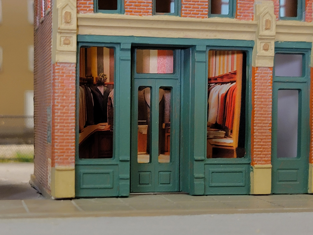
Again, I trimmed the image to fit the structure on Freemont Mills, and found myself once more happy with the results. I don’t know about you, but if I saw this interior on a layout, I wouldn’t bat an eye!
AI image generation programs can demonstrably be used to design structure interiors for model railroad layouts. Not only is this method easy to use, it’s highly cost efficient, can be used for any scale, and the only limit to what you’re able to design is your imagination. If you find yourself encountering difficulty producing usable results, I recommend simplifying your prompt until you get something that you could work with, and expanding from there. That way, you’ll learn the limits of the program you’re using, and also learn how to properly structure a prompt.
If you try this method yourself, let us know – we’d love to see your results!




It seems like the article is missing the photo of the coffee shop interior installed in the model building.
I have playing around with this myself for the layout I am working on. What I have found out is that the better and more explicit you pose the question the better the result.