News & Reviews News Wire CPKC debuts first locomotive in new livery

CPKC debuts first locomotive in new livery

By Bill Stephens | May 13, 2024

The locomotive will be on display at Union Station in Kansas City this weekend

Email Newsletter

Get the newest photos, videos, stories, and more from Trains.com brands. Sign-up for email today!

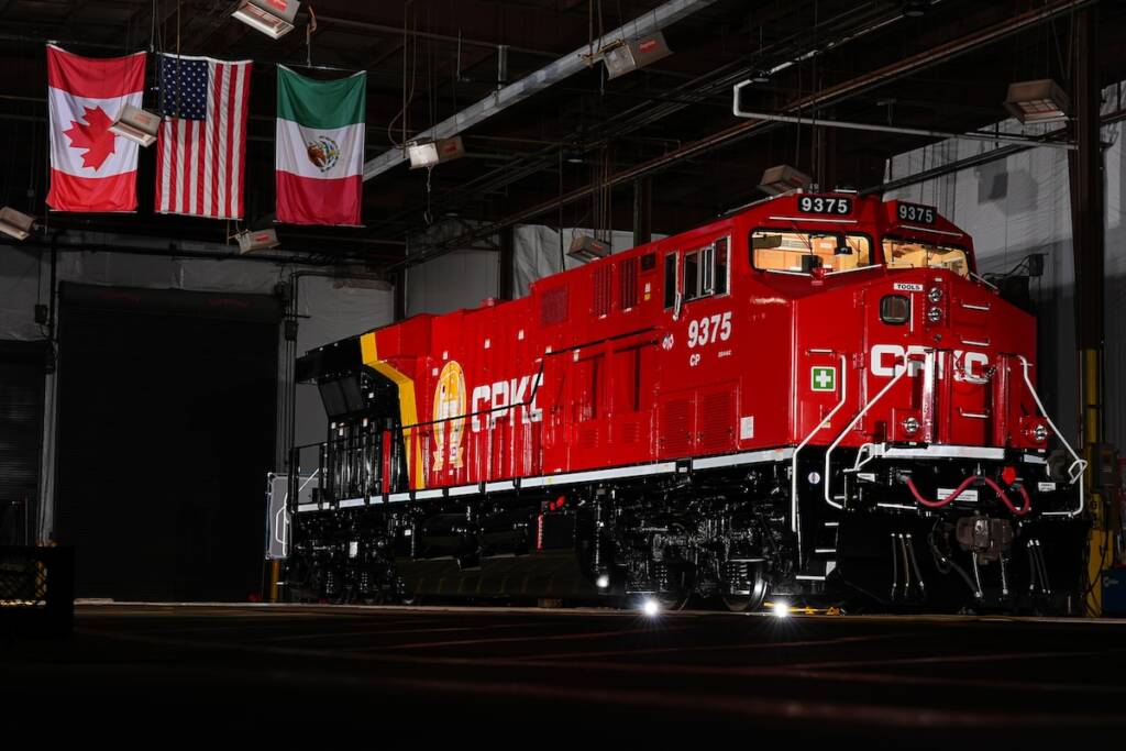
Canadian Pacific Kansas City ES44AC No. 9375 is the first to wear the merged railway’s new locomotive livery. CPKC

CALGARY, Alberta — Canadian Pacific Kansas City today unveiled the first locomotive to wear the railroad’s new paint scheme.

CPKC ES44AC No. 9375 made its debut in the video posted on the railway’s social media channels. The locomotive will be on display in Union Station in Kansas City on Saturday, May 18, as part of CPKC’s Final Spike Steam Tour with CP 4-6-4 No. 2816.

Employees chose the new livery from five options last year. The livery is CP red, features the CPKC beaver and shield logo on the long hood, and ends with a splash of gold and black that begins at the radiator section of the locomotive.

17 thoughts on “CPKC debuts first locomotive in new livery

  1. Nice looking livery on a locomotive. Now change that awkward sounding railroad name to something like, “Canadian Pacific & Southern.”

  2. “The livery is CP red, features the CPKC beaver and shield logo on the long hood, and ends with a splash of gold and black that begins at the radiator section of the locomotive.”

    Well, that’s one. If they do one every year, they will get their fleet changed over… when… never?

    It should say, “…features the CP Beaver and shield on the long hood…” since the shield still looks like the old one although I guess if you stood on the loco walkway you might be able to read the initials of KCS and KCSdeM. About the only thing that is really different is the CPKC on the side which still blares CANADIAN PACIFIC and its ode to Kansas City. Don’t know if that is KC-Missouri or KC-Kansas… It sure doesn’t seem to represent Kansas City SOUTHERN much.

  3. The Belle scheme is the best looking diesel paint diagram in North America. Too bad it will go away-eventually. It took KCS over a decade to repaint the fleet in the Belle scheme, and there are still some KCSM GE’s knocking around in gray-saw on Saturday on a TXUX coal train. And if CP’s history on repainting their fleet is any guide, 30 years from now, there will still be units in Action Red kicking around. So the Belle is probably safe for a while.

    Someone observed that the unit they picked for this, CP 9375, was in pretty good paint as it was, and wondered why, given all the diesels in cruddy paint, they didn’t pick one of those. Go figure. It doesn’t look bad, but what it’s replacing is classic, so it’s hard to get excited about the new paint.

  4. In my opinion, the new livery doesn’t fairly represent both railroads. It’s very CP-heavy, right down to the font used for the reporting mark. Very little KCS influence, especially taking the ‘Southern Belle’ scheme into consideration. I guess it would’ve been difficult to merge the paint schemes without it looking garish or abstract. There’s also the fact that CP is much larger than KCS.

    1. No, they had one which would have worked to represent both railroads and we saw it here in Trains Magazine. But the “employees,” (yeah,, the Canadian Pacific Employees) voted on this “Clearly Canadian” version so, oh well…

  5. Notice the “CP” sublettering on the lower cab side. It’s still a CP locomotive. I don’t think the railroad subsidiary companies have actually merged. I think they are still corporately separate subsidiaries of CPKC.

  6. I don’t find this paint scheme to be attractive, at all, other than the beaver logo making a return. It seems very uninspired, but they didn’t ask me!

    1. Am I showing my age? I liked – loved – the 1960’s – 1970’s CP Rail livery.

    2. They are $31B in hole making this merger. Don’t expect a rapid repaint program nor anything fancy for a while.

    3. You mean the one with the PAC-MAN (waka waka waka) logo on the end, Charles?

  7. I like the clever way they incorporated all 3 merger roads in the Beaver Logo and the 3 country flags on the side of the cab. Great looking livery, always was a big fan of CP red.

  8. It’s okay I guess, but the name is a mouthful. They should have bought the name “Pan American Railways” from PAS/Guilford 🙂

    1. Then it would have had to been called Canadian Pacific Pan American or CPPA. That would’ve been too big a mouthful to suit Keith Creel. Remember this was never meant to be a merger. They only said that to hasten STB approval. In reality it was a buy-out, plain and simple. a 31 Billion dollar buy-out and to the victor goes the spoils…. lol…

You must login to submit a comment