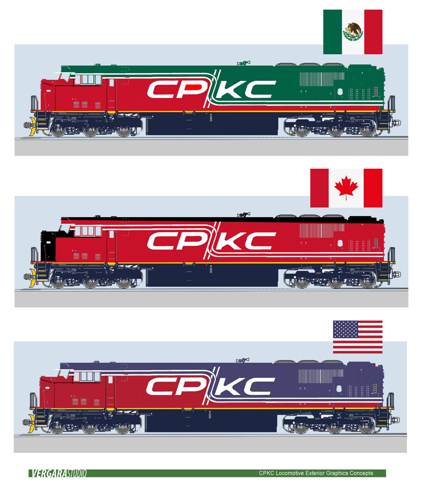
RIDGEFIELD, Conn. —Today, June 15, is the last day employees of the recently merged Canadian Pacific and Kansas City Southern can vote to select one of five new locomotive paint schemes proposed by CPKC management [see “CPKC employees will select railway’s new locomotive livery,” Trains News Wire, June 5, 2023]
In the meantime, acclaimed rail industrial designer Cesar Vergara has come up with a pattern whose three iterations are keyed to the flag colors of Canada, the U.S. and Mexico. After posting the drawings on his LinkedIn page last week, Vergara tells Trains News Wire he did it “at his own expense and risk.”
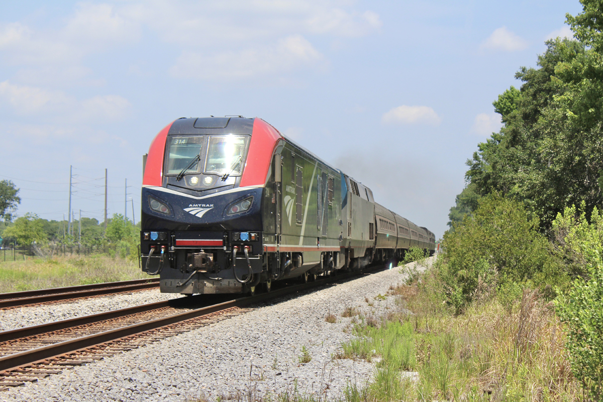
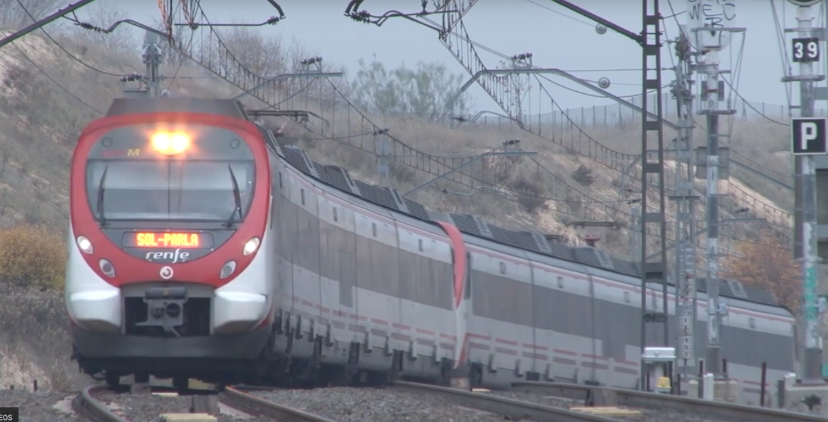
Vergara, a Swedish-trained native of Mexico who joined Amtrak in 1990, played a lead role on the company’s in-house design team that came up with the “Pepsi Can” red, white, and blue striping for General Electric’s P32-8BWH locomotives; the elevated fins on Amtrak Cascades Series VI Talgo trainsets; and a variety of other contributions.
He left Amtrak in 1999. Some of his subsequent accomplishments are displayed on the VergaraStudio company website. A Talgo Bistro car featuring his interior design was recently rescued from being scrapped [see “Northwest Railway Museum to preserve Talgo Bistro car,” News Wire, Feb. 21, 2023].
CPKC appears set on a single paint scheme to be applied to all locomotives. But an intriguing aspect of Vergara’s proposal is that different color variations of the same design could parade through the three host countries in the same way that heritage units spice up otherwise similar locomotive consists.




Red is the only common color among the flags of the three nations served. Go red!
These paint schemes are much better than the uninspired ones that CPKC came up with.
You mean that CP came up with. It says CPKC on the merger document but in essence it is CP 70% and KCS 30%. This was less a merger than it was a buyout by Canadian Pacific. And people thought Hunter Harrison was dead!!! And yes, they were uninpsiring.
You mean that CP came up with. It says CPKC on the merger document but in essence it is CP 70% and KCS 30%. This was less a merger than it was a buyout by Canadian Pacific. And people thought Hunter Harrison was dead!!!
Yes, they were uninspiring. Even number two of Vergara’s designs is better that any of the CP inspired designs.
My bad on the double post…sorry.
At least he didn’t put “Elvis sideburns” on them a la NJT!
I love it.
I like an all white scheme, as in “raise the white flag”……………
I see the validity to the thought and it may be worth considering but the C suite gang I’m sure will reject the idea.
Unfortunately Gerald is right the only thing that matters to the customer is timely safe movement of their goods.
I’m for one unified pair scheme.
I think that if you keep both liveries and just change the name and reporting marks, you run more of a red team – green team conflict a la Penn Central, rather than attempting to unify into one company.
I’ll repeat, there is absolutely no reason to have a unifed paint scheme. Almost no one cares about a united scheme except the company itself. Customers really do not care what the equipment looks like as long as it performs the job it’s supposed to do. I understand from an expense point of view it’s less expensive to maintain only a single paint scheme then to have multiple paint schemes you have to keep paint on hand for, but when you have two like the current KCS and the CP Beaver paint schemes, those are both brilliant enough to stand on their own. As long as the name on the side of all the equipment is the same, nothing else has to change.
KCS and CPR liveries are too different and they clash if in the same lash-up. Rock Island had that problem in its ater years.
Really nice design with the rail track symbolism showing both north/south and east/west route components. The flag colours are a great idea that acknowledge the countries served by the railway. Too bad that it isn’t an option.
I think I like these best!
Yuk