In the 1920s, the United States poured millions into a federal highway program that coincided with the automakers’ creation of lower-cost cars. The developments enabled almost all Americans the freedom to travel independently for the first time. But personal cars – even limousines – were cramped for families, offered few amenities, and had limitations that made long auto trips physically miserable. The automobile was good for short hauls and day trips, especially for residents of out-of-the-way towns. In cities, commuter trains still provided day-trip opportunities that even today seem seductive.
The nation’s railroads responded to the automobile with deluxe services and scenic-travel opportunities that motorists could not match. And the railroads took just as much care in designing the promotional materials for these travel opportunities as they had in planning the luxury trains. True, not everyone could afford that kind of travel. But those who remember being crammed for hours into a pre-World War II car on a cross-country trip also remember the envy with which they devoured the railroad advertising that made them wish they were on the train, not sitting next to a competitive sibling, unable to move. And if a crack limited happened to pass the highway, the envy escalated almost unbearably.
The railroads’ advertising and brochures made their way into millions of households. For the most part, the campaigns were as identifiable as the railroads themselves. (“Branding” is not new.) Each railroad hired the best commercial artists and designers to illustrate and create calendars, brochures, posters, timetables, guidebooks, and an array of other printed pieces that ranged in size from large posters (now prized collectibles) to matchbooks and match boxes (equally collectible).
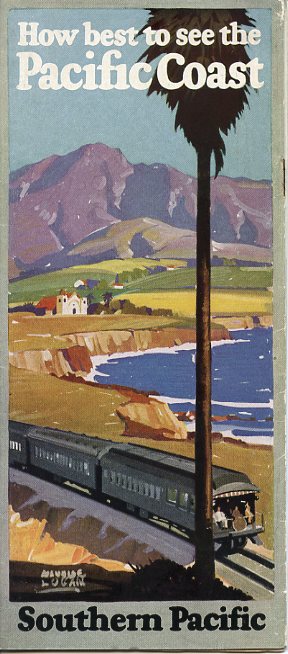
Southern California was an especially alluring area for Northerners and Midwesterners in the winter, and the Southern Pacific Railroad did not overlook the opportunity. It hired an array of prominent designers and artists for its promotional work, among them Maurice Logan, a Californian who painted in the state’s distinctive style, examples of which are coveted by Arts and Crafts collectors today. His 1928 watercolor illustrations for “How best to see the Pacific Coast” tempt the traveler with a Spanish mission, palm tree and coastline of California as well as the snow-capped peaks, conifer forests, and rushing streams of the Pacific Northwest. The trains in the illustrations are not as up-to-date stylistically as the art itself. But they do not dominate the pictures; the scenery does. Logan knew how to create desire.
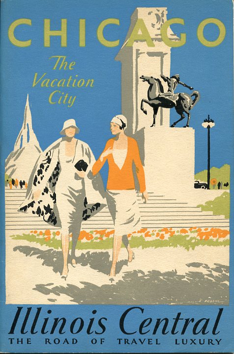
In 1930, Illinois Central (“The Road of Travel Luxury”) issued a guide called “Chicago: The Vacation City” with an opening quote from Illinois poet Carl Sandburg: “Come and show me another city with lifted head so proud to be alive.” The cover is a sleek, mostly light-blue-and-white watercolor by Chicagoan Paul Proehl, who threw in touches of orange, black, gray, and light green for contrast. Two young women stride forward from a Lake Michigan park with a brand-new sculpture in the background, drawn in idealized fashion. They wear the latest, somewhat revealing (for the day) clothing, wind-whipped for Windy City effect. The women show a lot of shapely leg. And there’s a suggestive skyscraper silhouette in the background. If you take the train to Chicago, you’ll find the allure of fashion, modernity, and daring architecture. And you can get around on the El, don’t forget. Who needs a car? Well, someone does, since there’s the suggestion of a nifty, long-nosed auto peaking from behind the statue. Proehl captured the urban landscape, not the natural, plus modernity and sex appeal. He, too, knew how to create desire.
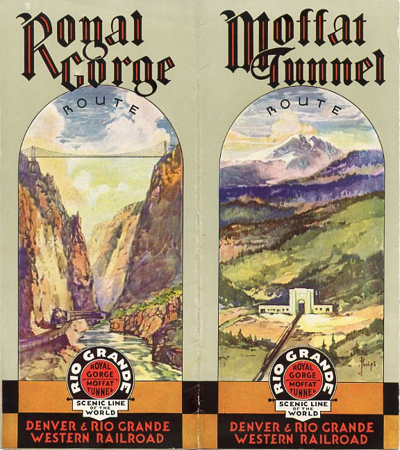
Sometime after 1934, the Denver & Rio Grande Western Railroad turned to advertising its “Scenic Line of the World” with three- and five-fold brochures illustrated with watercolors and crayon drawings by Frank L. Philips, a Denver commercial artist. Compared to Proehl’s Chicago work, Philips’ is modest, almost retro in appearance. The brochures emphasized the railroad’s two spectacular engineering feats: the Moffat Tunnel west of Denver, and the twisting route along the Royal Gorge in Colorado – both places where autos could not go. (A scary suspension bridge spans the gorge; the train travels along the Arkansas River.) The five-fold brochure has a cartoon-like map, typical of 1930’s design, that depicts numerous attractions. It was the creation of Charles A. Dietemann, a commercial artist in Denver. His work has Disney-like traits and suggests that a good time will be had by all. Philips is far more serious and suggests that we vacation to be awed and informed, not to fulfill desire or be entertained.
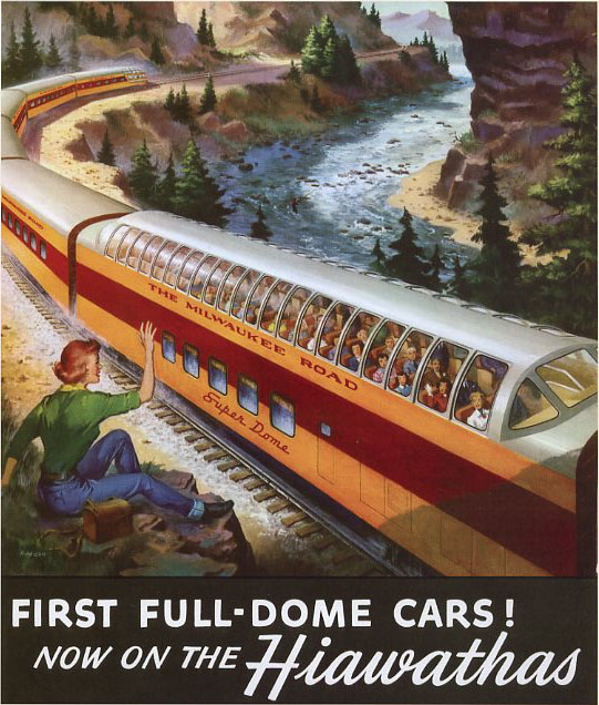
Finally, from 1953, we have a Milwaukee Road calendar that promotes the Super Dome cars that it added to its trains in 1952. Artist Robert Addison of Chicago portrays the road’s Olympian Hiawatha in a mythical but very scenic, mountainous western canyon. A single Super Dome car dominates the image, encouraging us to want to travel for the sake of seeing wonders in comfort. A comely woman sits on an outcrop at the lower left, waving delightedly at the train, many of whose passengers turn towards her and away from the scenery to their left. A fisherman, barely visible, casts into the rock-strewn waters of the river in the background. Here we are both up-to-date and communing with nature simultaneously. We don’t have to break a sweat, and we are admired by those who do. Perhaps, Addison suggests, it is possible to do both, but not at the same time. Addison signed the illustration only with his last name, but his widow, Betsy, has confirmed that he was indeed the artist who then worked for a Chicago advertising agency. Addison, too, could create desire … G-rated desire.
It is unusual to identify artists who worked for advertising agencies; it is more common to identify them if they worked independently. For this brief overview I have concentrated on printed pieces credited to an illustrator or painter. Throughout the entire 20th century, railroads from the East to West coasts and all points in between churned out printed pieces, reaching a high point in the 1930s and ’40s. As passenger train frequency declined, so did the advertising pieces. In this age of a single national passenger train company, Amtrak, it is easy to forget the individualized and creative publicity and advertising work of the passenger railroad industry. But at the industry’s peak, the railroads looked to the best in the graphics business to promote their services in ways that ranged from the sober to the seductive.
JOHN GRUBER is a long-time Trains contributor, founder and president of the Center for Railroad Photography and Art, and editor of Railroad Heritage. He has been a freelance railroad photographer since 1960, and received a railroad history award from the Railway & Locomotive Historical Society in 1994 for lifetime achievement in photography.


