Metra’s new Clarendon Hills station
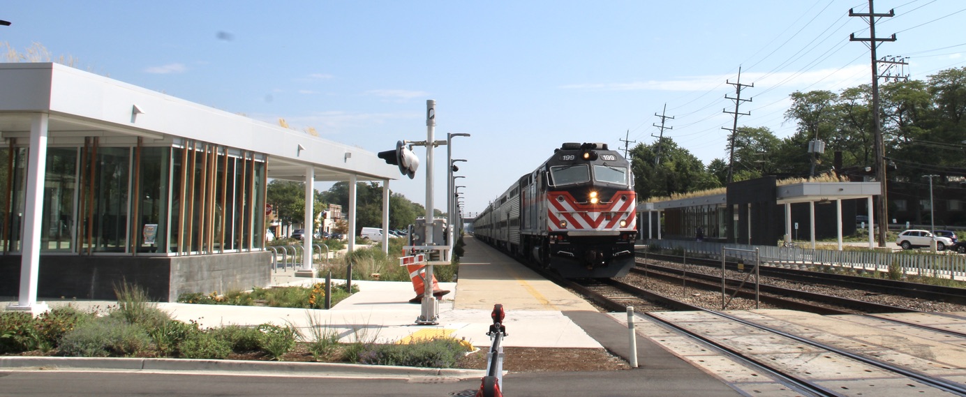
New Metra stations are rare enough. One on the Chicago-area commuter operator’s most-used line is a particularly big deal, given how many people will likely use it — and how long it is likely to be used.
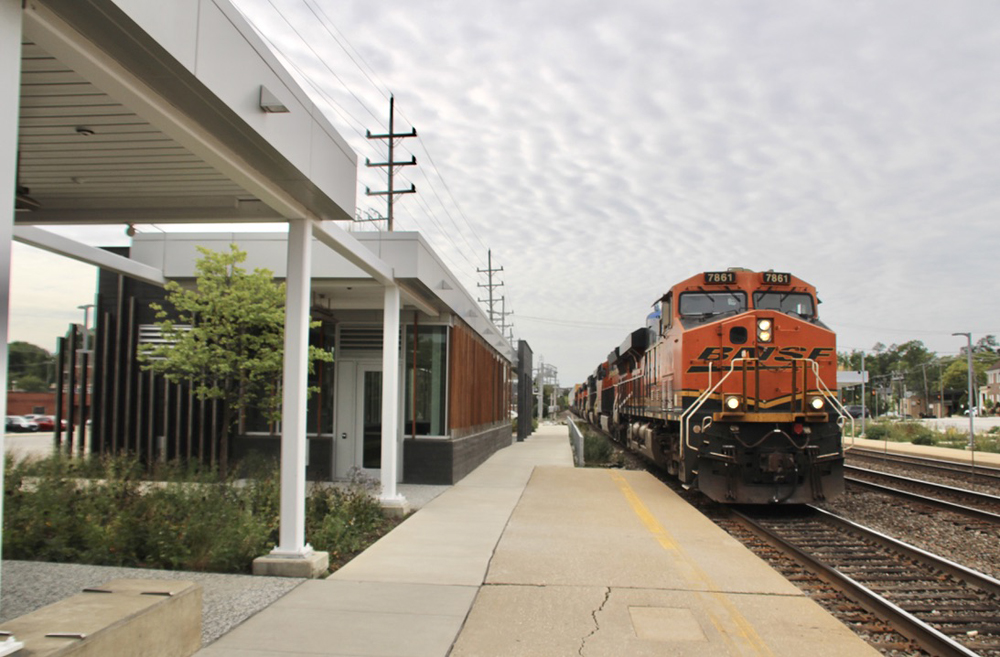
So it seemed worthwhile to devote one chapter of our occasional series on Chicago railfan locations to the new station in Clarendon Hills, Ill. The station has been in service for a while, but as of my most recent visit, there were still small details to be completed. To the best of my knowledge, there has never been an official grand opening ceremony for the structure, just off Prospect Avenue near its intersection with Ann Street, and of course, adjacent to BNSF’s Chicago Subdivision main line.
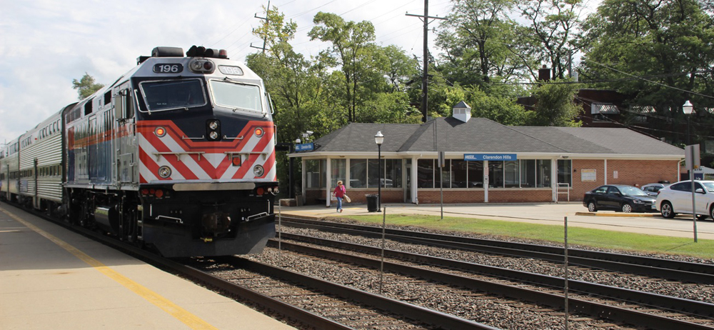
There’s good news and bad news about the station, which replaces a structure built in 1965. The good news: Functionally, it’s a significant improvement over the old station, which was perpendicular to the tracks, a somewhat less-than-ideal layout for a commuter station. And the new facility has some features which other Metra stations would be wise to adopt. The bad news: It’s not particularly attractive.
First, the good news.
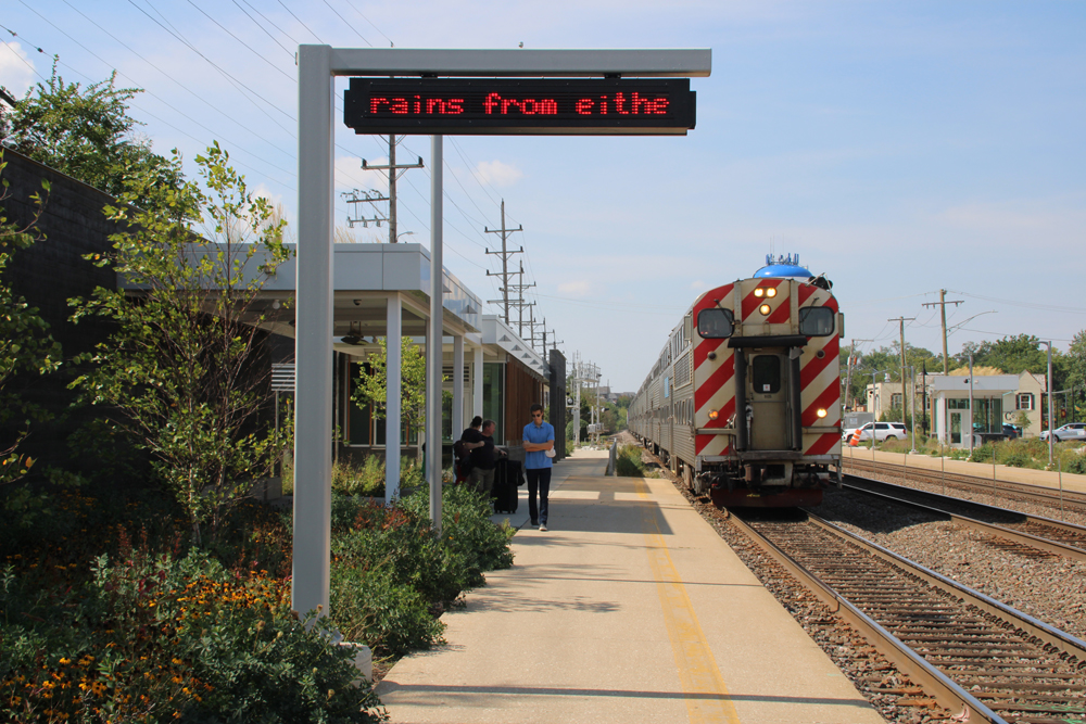
This is one of the very few stations that truly invites people to wait for trains along a large portion of the station platform. On the inbound platform — which is, realistically, the one where most waiting occurs — the main station building is at one end and there’s another enclosed structure, which Metra usually refers to as a “warming shelter” or “warming house,” at the opposite end. In between are a couple of open but covered patio-like spaces with benches. While these are particularly inviting in warm weather, they also have ceiling heaters to make them usable during the long midwestern winter, as well.
There’s also a decent-sized warming shelter on the outbound track. This is rarely the case at most stations, where the presumption is that far more outbound traffic will be arriving than departing. It’s nice to see that this station is taking care of people traveling in either direction.
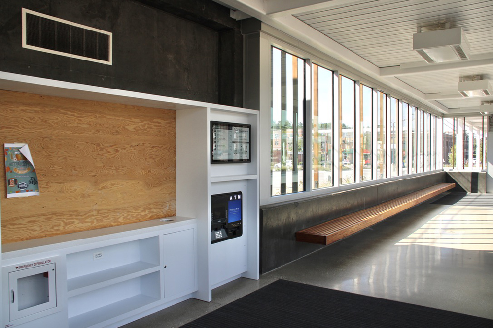
The primary station structure has a TV monitor showing arrival times for the next several inbound and outbound trains. It doesn’t show whether they’re on time or not, which would be even more useful, but even so, given how much I see some people struggle to read printed timetables, it’s a user-friendly improvement. Right next to it is another very smart, user-friendly feature: an ATM. There also appears to be shelf space for the kind of free book exchange offered at many other Metra stations, though nothing’s been done with that yet.
No restrooms, which I always consider unfortunate, but I get that it simplifies things considerably from a cost and safety standpoint.
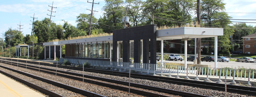
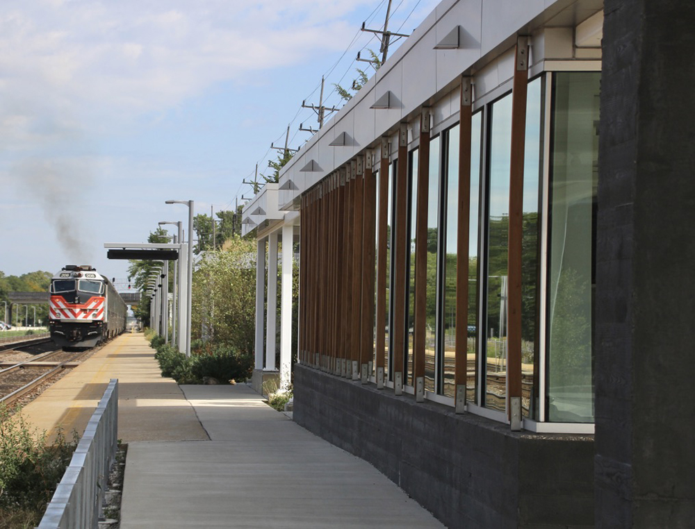
As for the design — I’m not an architecture critic, but I’ll play one on line. The building’s look is pretty utilitarian: blocky, concrete, largely unadorned.
Legat Architects, the designer (for the city; ownership of Metra stations varies, but this one was a city project), explains the thinking behind the design in this 2019 article on their website. It describes the structure as a “a cost-conscious station that offers more openness and amenities,” and quotes the chairman of the village’s Downtown Design Review Commission as saying “we didn’t want to overstate the design of the station so it took attention away from key buildings such as the Village Hall across the street. At the same time, we did want the station to be a welcoming entry point to the village.”
On the first of those points, it certainly succeeds. Not so sure I see the “welcoming” part, though.
There are a few design flourishes that flatly don’t work. There are randomly spaced wood slats over the large windows; I looked at them and thought, “seems to me like they mostly just mess up the view out the window, but it’s the kind of thing somebody in architecture school would say suggests motion.” On the Legat site, it says they exist to “create a more natural look, provide morning and evening solar shading, and imply a sense of motion.” (Ha!) And there are some steel rails sprouting out of the ground and adorning one side of the building for no discernible reason. We get it; this is not a ferry building, it’s a railroad station.
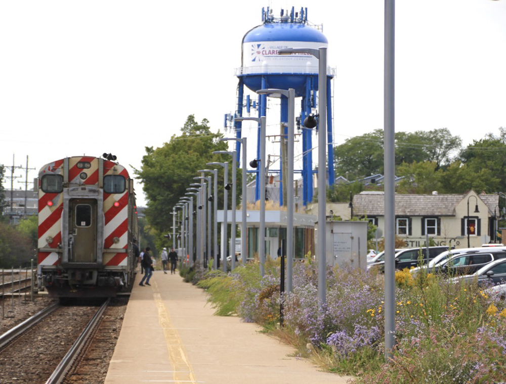
The design does deserve credit for its emphasis on sustainability, which includes native-plant landscaping (there are even some cornstalks in there) as well as prairie grasses on the “green” roof. This fall, the blooming wildflowers in the landscape areas were certainly more picturesque than the former strip of lawn they replaced.
So, from a functional standpoint, the new Clarendon Hills facility does its job far better than the one it replaced, and better than many others on the Metra system.
From a visual standpoint … well, did I mention how well it does its job?
