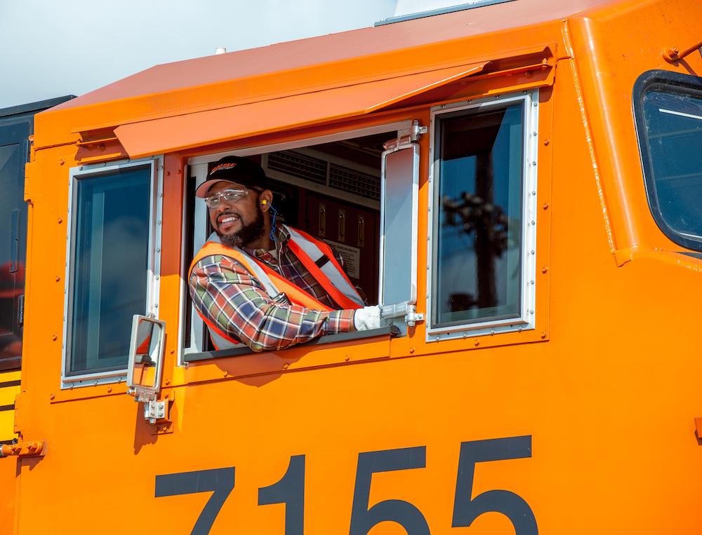
Locomotive schemes
After publishing a list of paint schemes last month called “Five of the worst locomotive paint schemes,” I was asked what schemes from the 1980s to today I find attractive. This is my list, and it’s in no particular order. Some I was fortunate to experience in-person during their prime, while others I have to settle on small fleets of painted power or post-merger consists that occasionally were assembled with all the same paint.
No. 1: Santa Fe red and silver
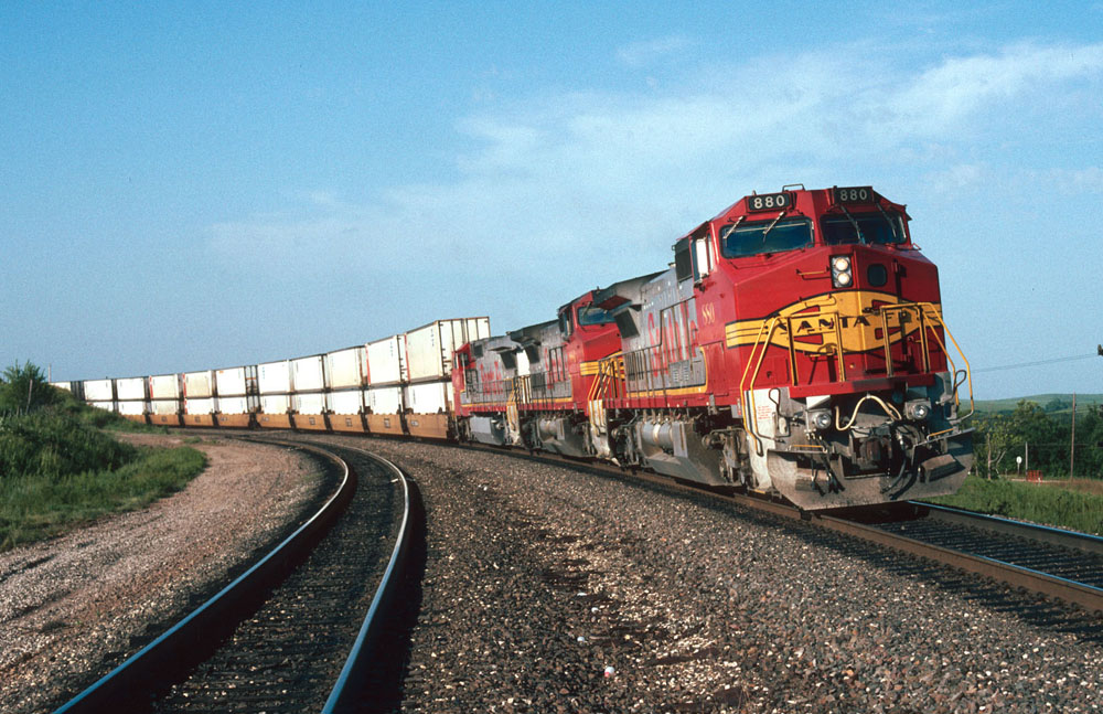
This classic scheme first applied to a passenger locomotive in 1937, was revived in 1989 when Santa Fe repainted its SDFP45 cowls in red and silver colors. Every new unit delivered from that point until the BNSF merger in 1995 would follow suit and be used to market its premium intermodal service to Santa Fe customers. BNSF would continue painting some of its new power red and silver, albeit with BNSF lettering, until it adopted its own identity for the merged companies.
Red and silver were something to see fresh out of the factory. They looked amazing in solid consists and complimented the striking blue and yellow scheme worn by the rest of the fleet well. They were just as fun to photograph trackside as it was to be in the engineer’s seat of a red and silver consist, ripping down the mainline at 70 mph with 7,000 feet of intermodal on the drawbar. Add in 23 red and silver cabless GP60Bs delivered in 1991 to make A-B-B-A type consists of old and it was a magical six years to be trackside along the Santa Fe during its final years of independent operation.
No. 2: Wisconsin Central
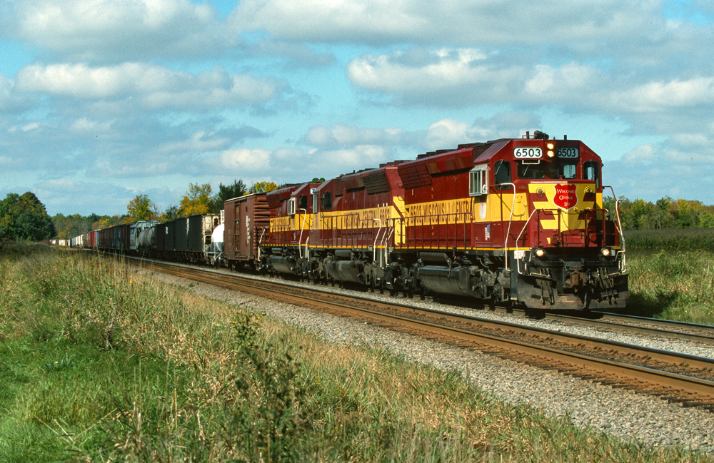
As regional railroads go, Wisconsin Central’s scheme is tops for me. While the core of their scheme was set early on, the railroad would try several different nose designs until the inverted Pine tree design was ultimate. Dirty or clean, their colors looked great in the wooded terrain of the Upper Midwest. Not surprising is a handful of locomotives still survive on CN’s roster in WC colors, hauling freight over two decades after the company took over Wisconsin Central.
No. 3: CP Script
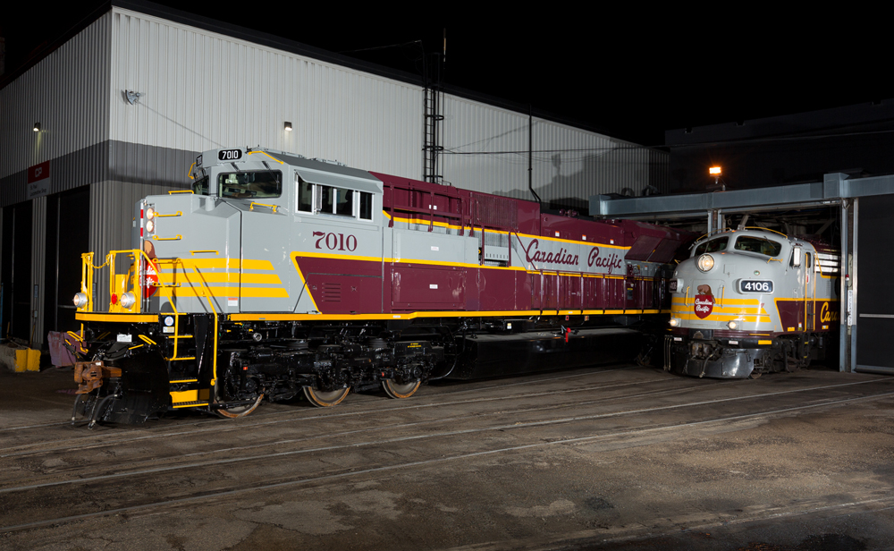
Canadian Pacific’s Tuscan and gray scheme with the script lettering has been my favorite for quite a while and the arrival of rebuilt SD70ACUs in the fall of 2019 would give me a chance to finally shoot mainline freights in these colors. The script design, first used by the company between 1962 and 1968, was then applied to its F unit fleet and a single GP38-2 in 2000, the latter to provide backup power for the F units, Canadian Pacific’s application of the script design on five rebuilt SD70ACUs make them a prime target for me trackside. Five additional SD70ACUs were repainted in the same design but with block lettering. I feel the reduced size gray band and hard-to-read lettering at a distance really change the feel of the scheme.
No. 4: KCS Belle
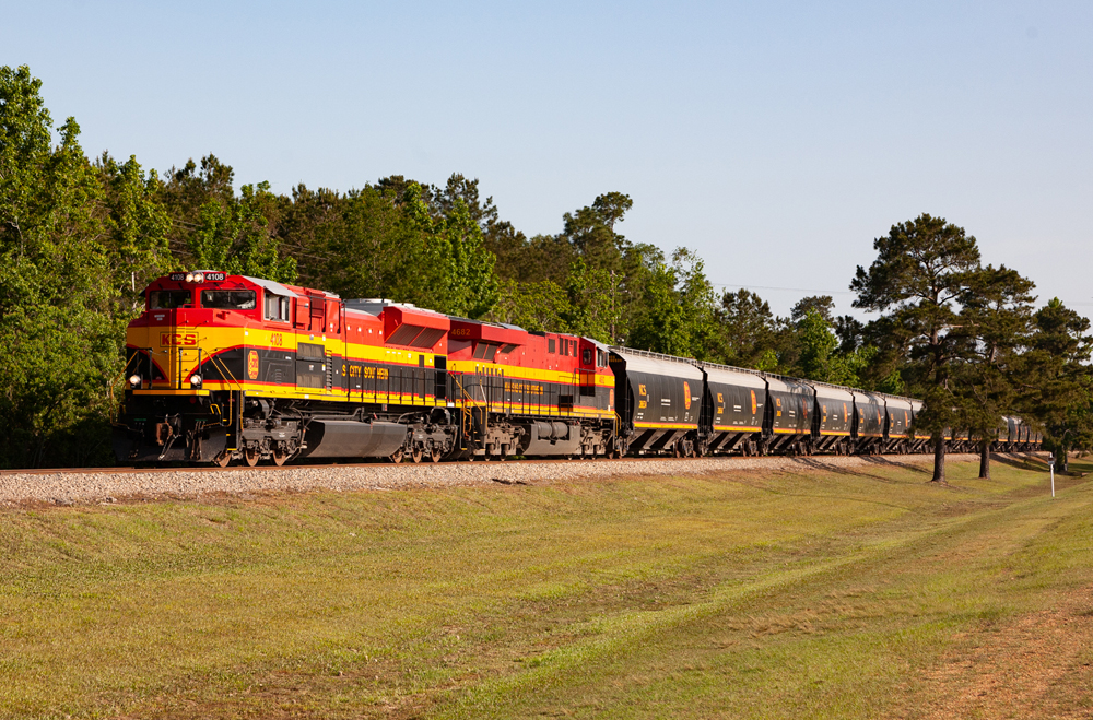
Much like Santa Fe’s red and silver, the KCS Belle scheme worn by its motive power at the end of its independence dates back to some of its earliest diesels when Belle colors were first applied to their passenger locomotives in 1940. The revival began when its business train power was repainted in the early 2000s and then adopted for the balance of the locomotive fleet a few years later. Although the gray scheme it replaced is one of my favorites as well, the red, yellow, and Brunswick green really stand out in any weather. Kudos to the company for ordering matching grain cars in Belle colors, though they didn’t stay together very long.
No. 5: DRGW
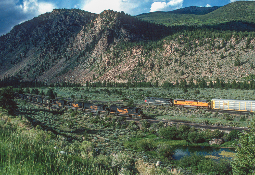
Rio Grande’s no-nonsense orange and black with its large carbody lettering stood out just like the MKT green and yellow or Soo Line red and gray schemes. While it’s not as flashy as some of my other choices above, it’s the railroad that conquered the Rocky Mountains across Colorado in my mind. Although I didn’t experience the independent Rio Grande before they bought Southern Pacific, several trips to Colorado over the years netted a few images of pure DRGW consists on home rails for the collection. Rio Grande’s change to the large carbody lettering in the late 1960s is my favorite design, though one could enjoy both small and large lettering for decades after the change, through both the SP purchase and UP’s acquisition of Southern Pacific.
Share this article